Mackariba Kitchen
Responsive Website
Role: UX Research, UX/UI Design
Client: Mackariba Kitchen
Timeline: October 3rd - October 14th
As a local of the jersey area this was a passion project for one of
the areas more low key mom & pop Jamaican restaurant. Social media being there only means of promotion the restaurant desperately needed to expand their online presence.
Background
The objective of this project was to design a responsive website that allowed users to visually experience all Mackariba Kitchen has to offer as well as build trust with the community through about us page and the interactive menu.
Goals
Research
I wanted a better understanding when it came to what the competition was doing to sell their brands to their users. Seeing what top tier local restaurants are doing right and what they may be missing so I can weave and fine tune my own designs to fit those spaces that are currently unoccupied.
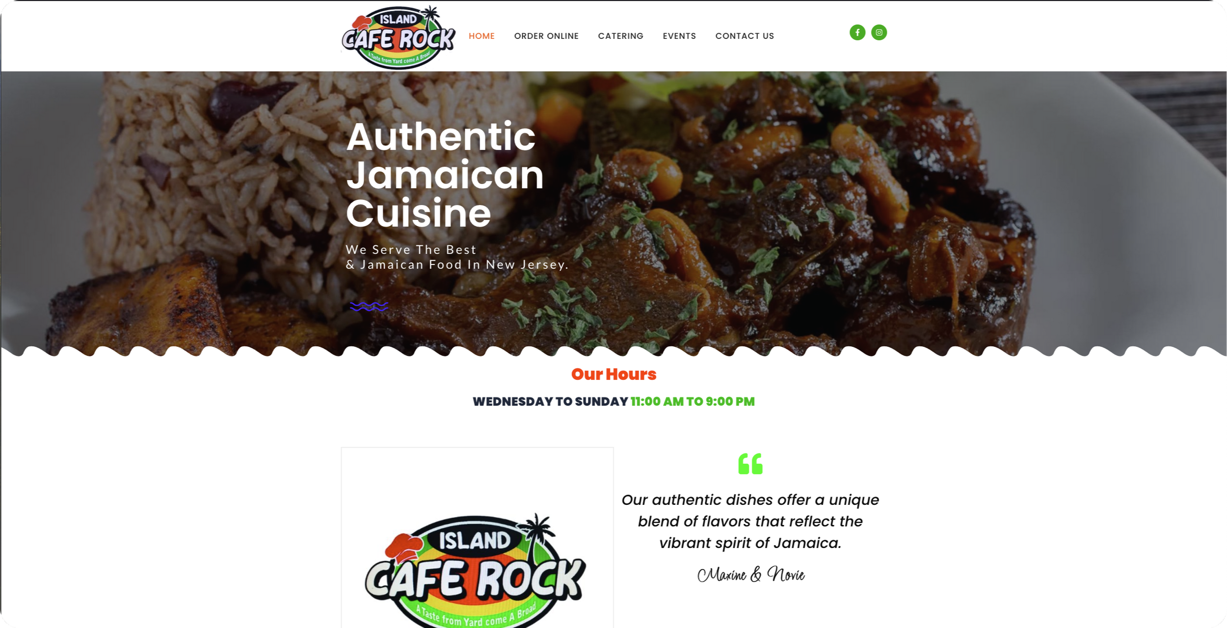
CAFE ROCK
Detailed about us page
Contact and FAQ
Easy and fun online order menu
Social media presence.
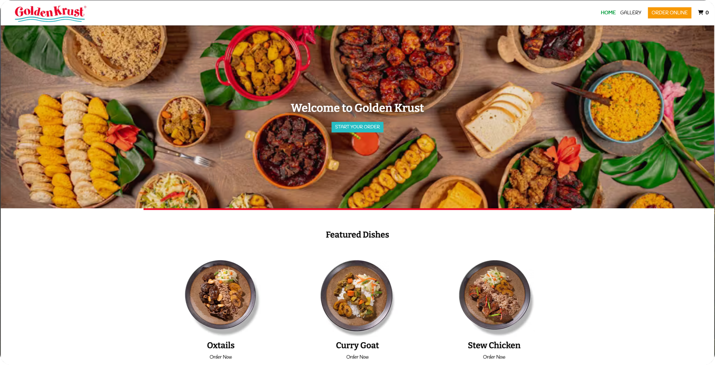
GOLDEN CRUST
Beautiful Images
Fun/Interactive UI
Hard focus on images to sell product
Impressive use of white space.
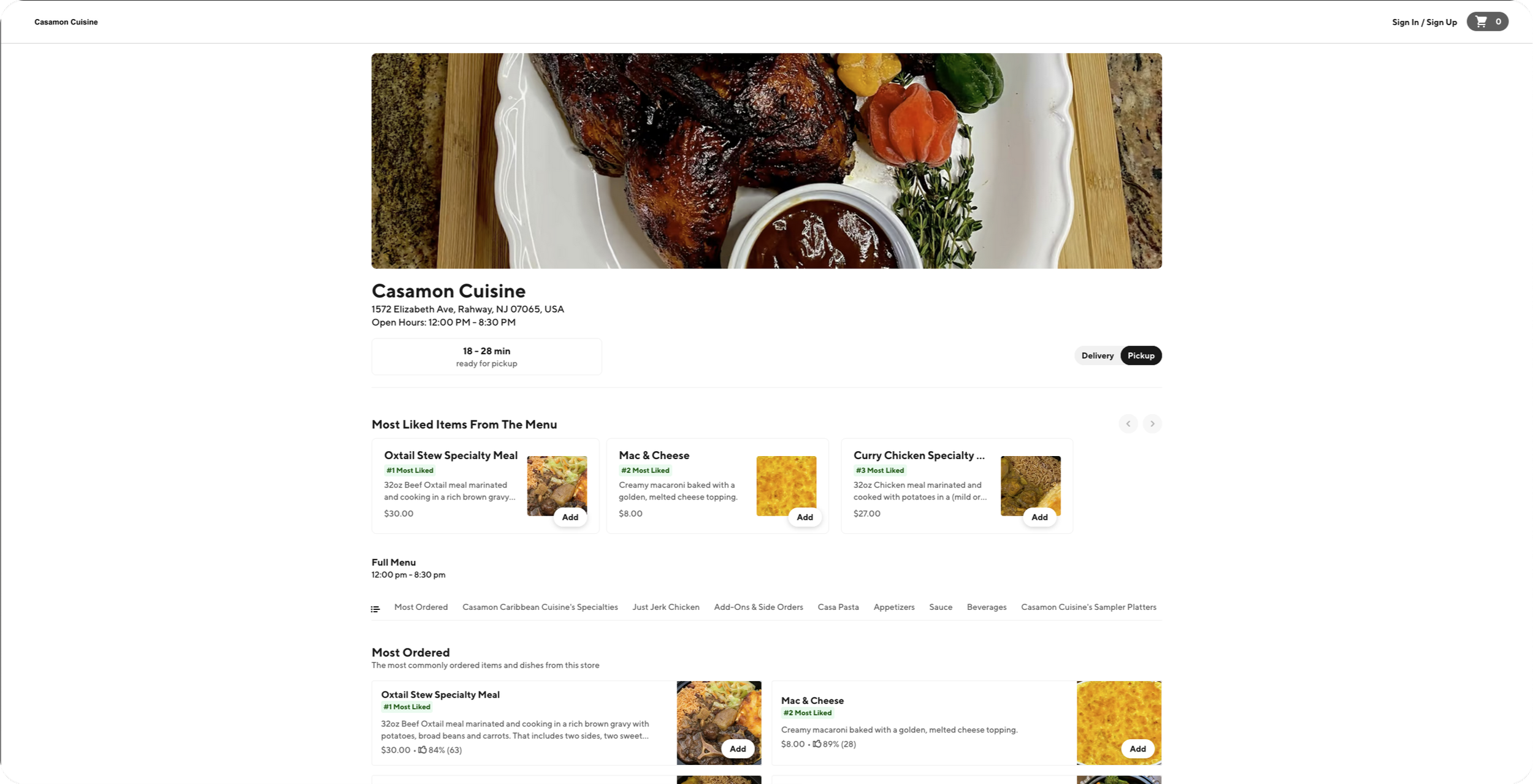
CASAMON CUISINE
Zero website presence
Hard to find hours
Menu only shows some of the items
Easy to reach social media
User Interviews
I jumped immediately into user interviews to gain a better insight on users interactions with local restaurants and their websites. With no client I focused all my concern on how users felt while browsing a new local website and how they responded to restaurants with zero website presence. I also made sure to think ahead to any technical considerations that may come up and halt the design process.
USER NEEDS
Having a clear and clean layout of the menu
Quality pictures of each item on the menu
Direct location and address of the establishment
Contact infotmation
Online order and takeout all located in the same website.
BUSINESS GOALS
Driving traffic to restaurant, encouring more foot traffic
Boost take out and delivery orders through intuitive mobile and desktop friendly ordering system.
Showcase restaurants brand and identify.
Enhance customer engagement and loyalty.Increase social media and online presence.
Attract new customers and repeat business.
TECHNICAL CONSIDERATIONS
Mobile Responsiveness: Ensure the website is fully responsive and adapts to various screen sizes for a seamless user experience across devices. Mobile-first design should be prioritized
Integration with Third-Party Systems: Seamlessly integrate the website with third-party platforms such as reservation systems (OpenTable), delivery services (UberEats, DoorDash).
Define
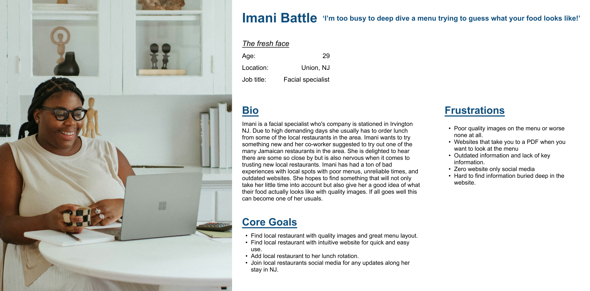
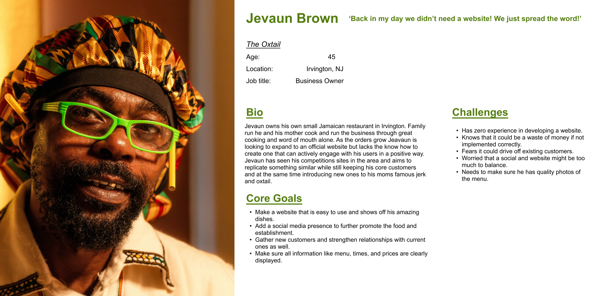
Based off the user research I compiled I went on to develop two personas, One that reflects the users and the other the business owner. Using this as the return point for any questions that arise in the design stage or if I need a refresh on the requirements and pain points when it came to designing for my user.
User Persona
Ideation
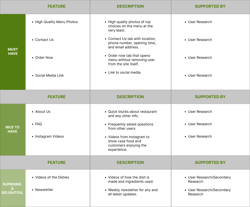
As soon as I understood and locked in who I was designing for I moved on to developing a feature set. This was mandatory when it came to understanding what was to be prioritized in the design process and every piece of the puzzle was developed off of the user research that was done prior as will be a trend in my design method.
Feature Set
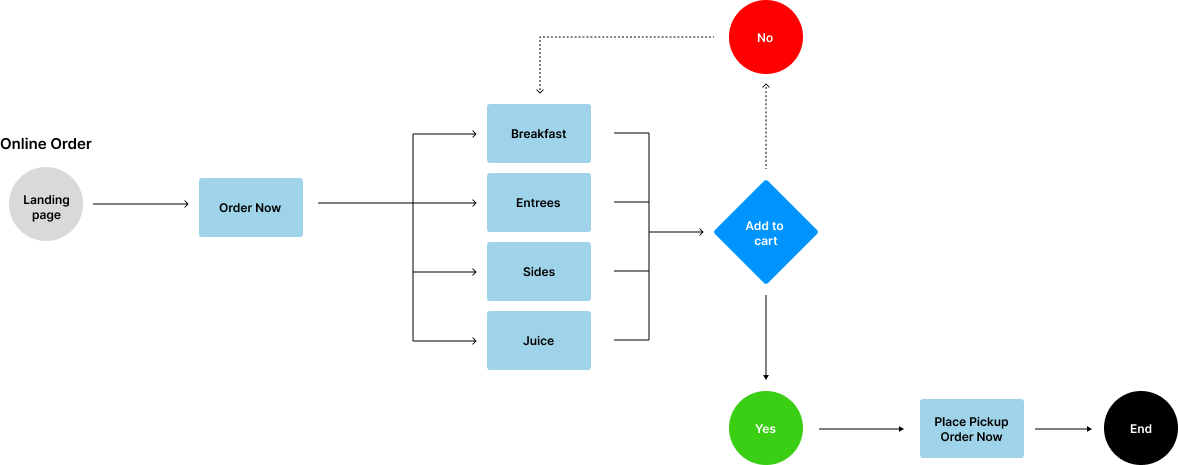
User Flow
After developing and understanding my priority features I started to create my user flows to help blueprint and visualize how my users will maneuver through my design. In this flow displayed I focused on how the online order will be paced. “Clear and Clean Layout” was a need from my users so I designed with that at the top of my mind to make sure I created an experience that simplifies my users life.
Design
Low-Fidelity Wire-frames
When working on Lo-fi wire-frames the focus was on speed. Designing these speedy sketches allowed for quick user feedback and pivots/iteration before moving into more time consuming designs. I worked with both desktop and mobile in mind, based on my user research most my users use mobile but do find websites with both mobile and desktop more trustworthy.
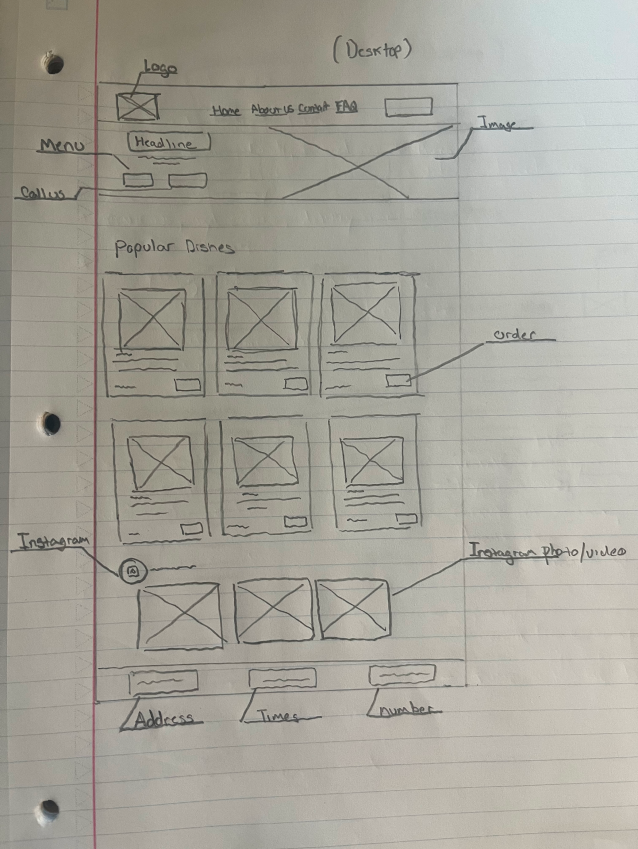
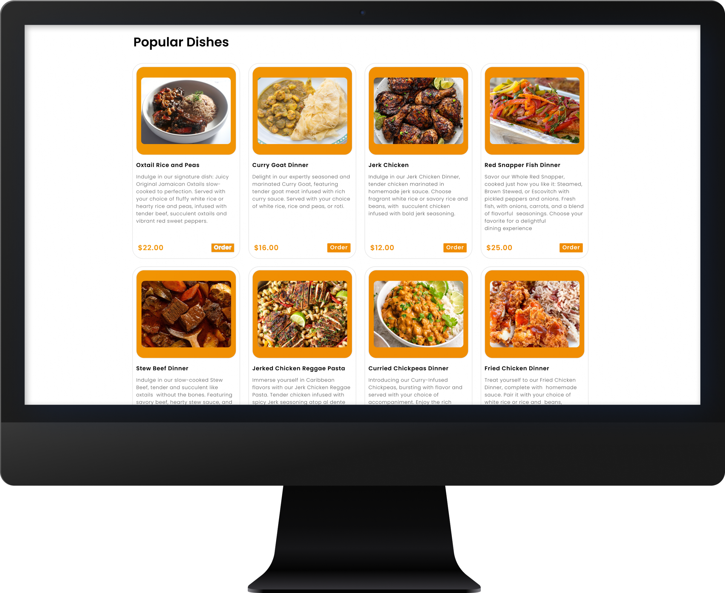
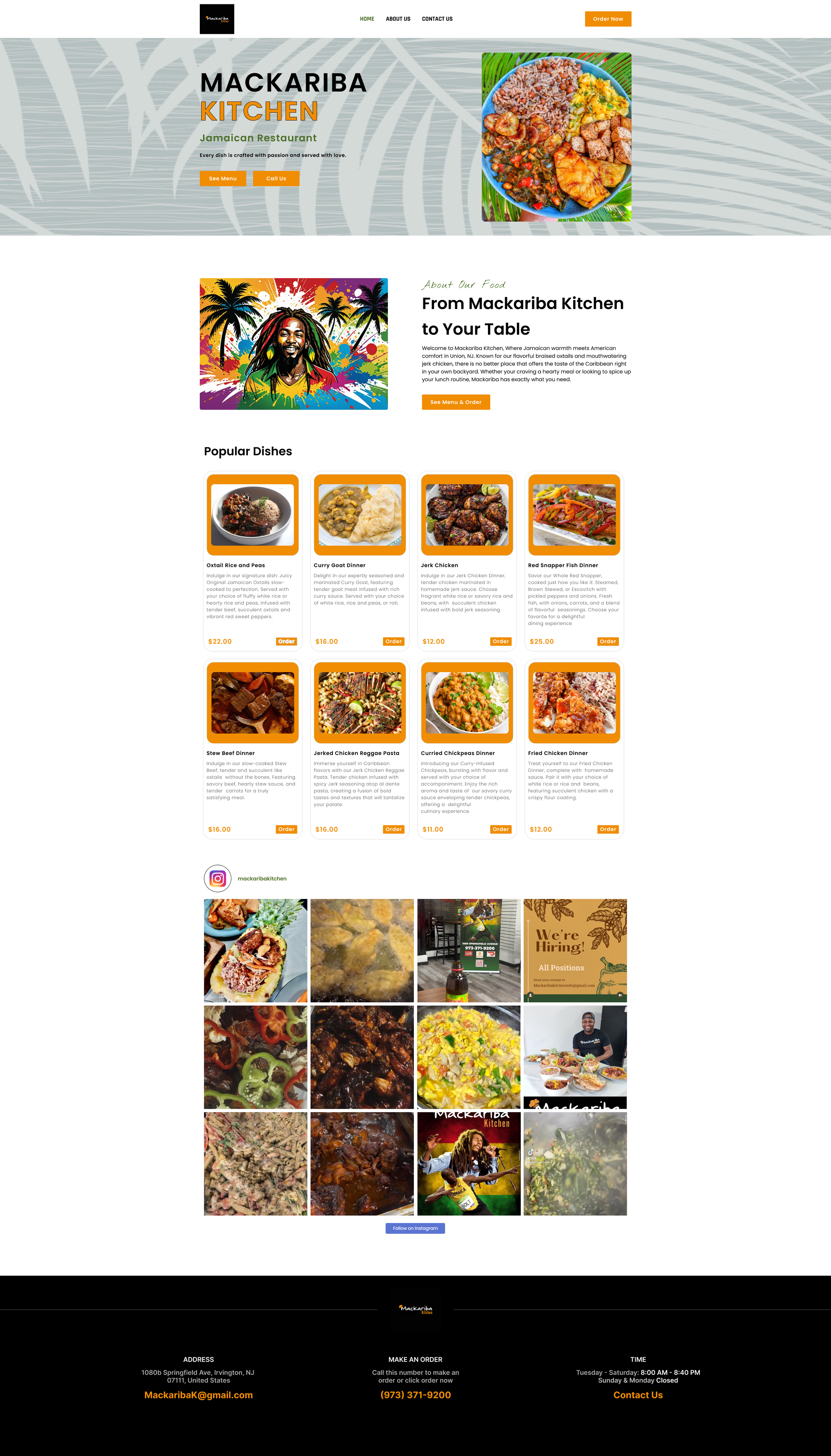
Desktop Homepage
CTA
Logo
Popular Dishes
Hero Image
Headline
Call us
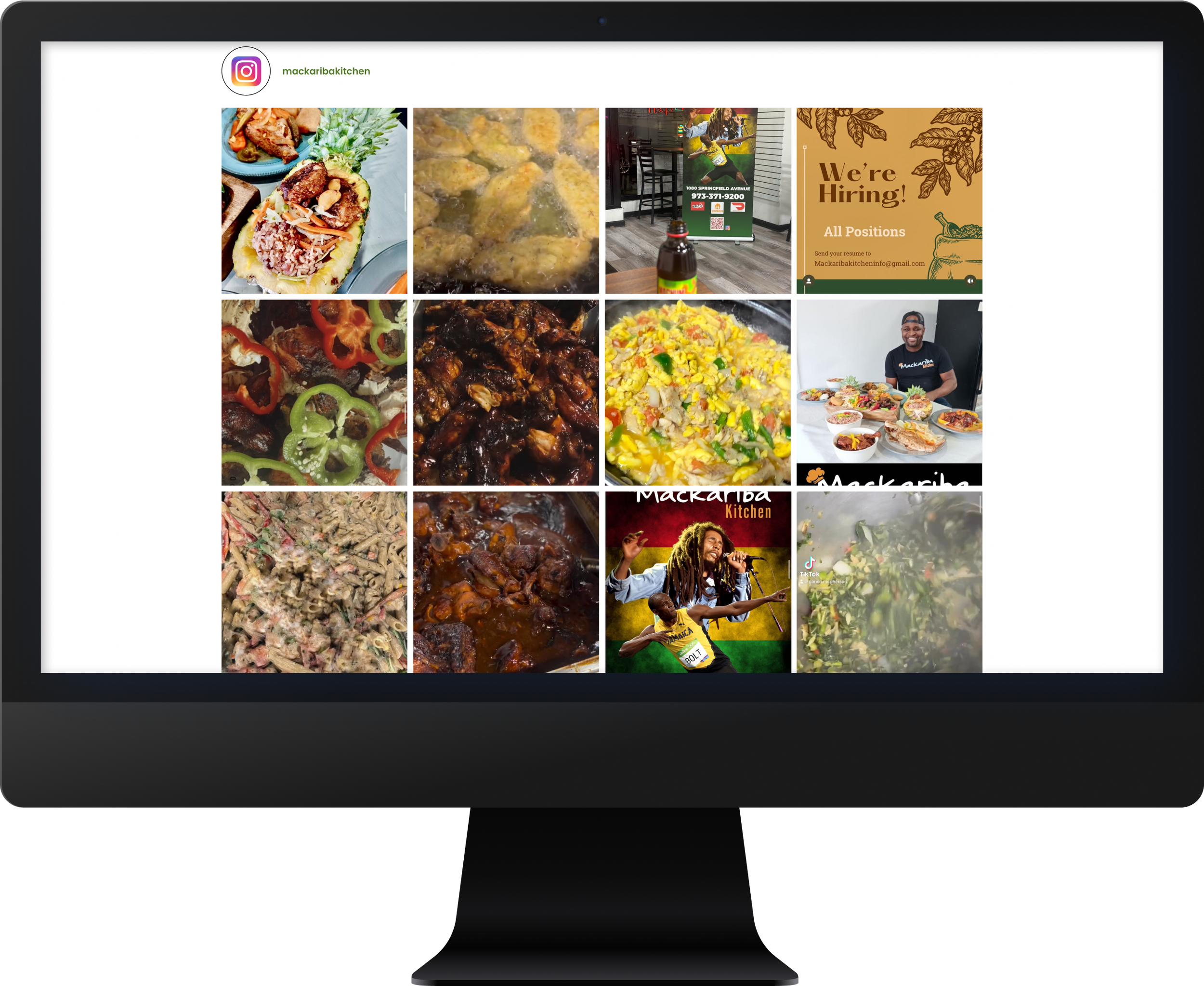
Instagram
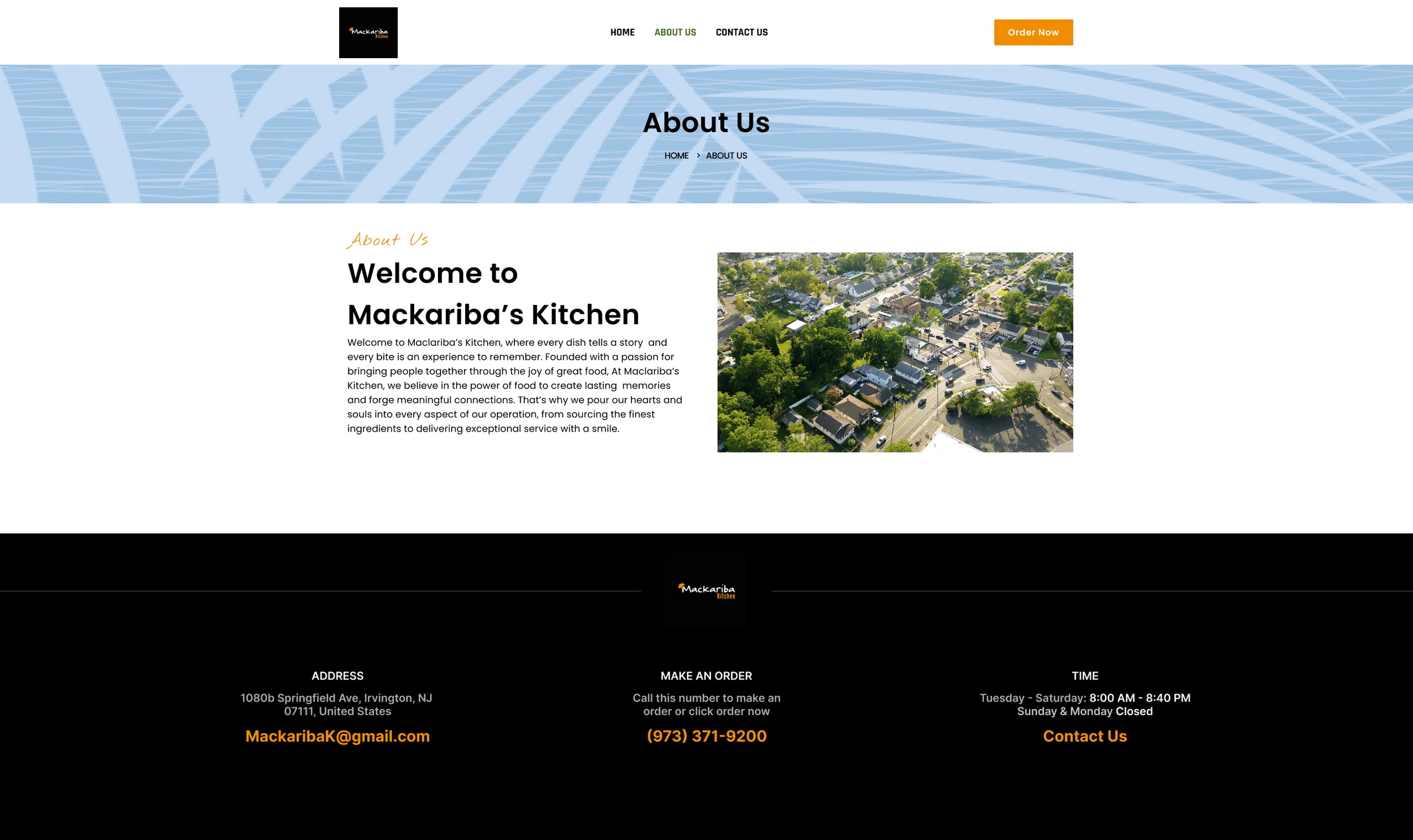
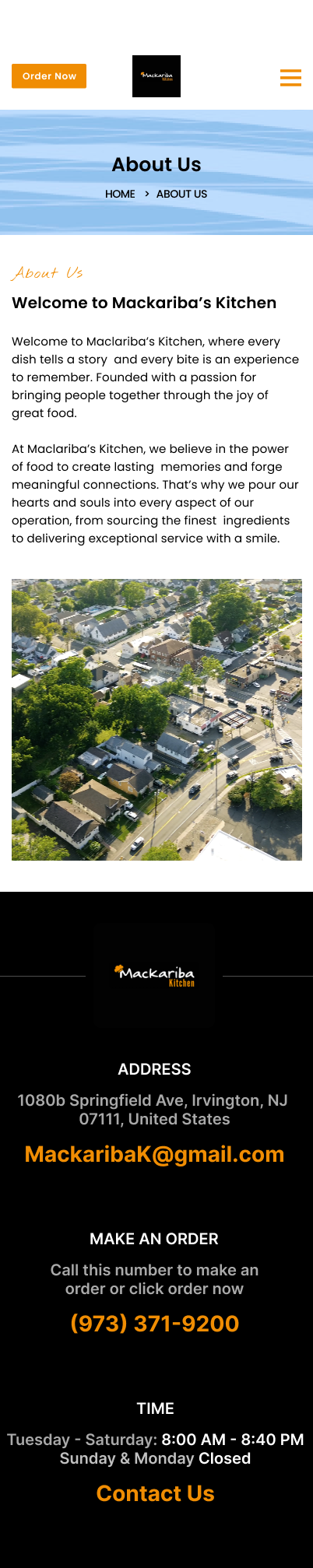
About us
Contact
FAQ
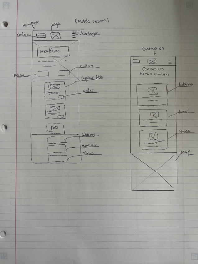
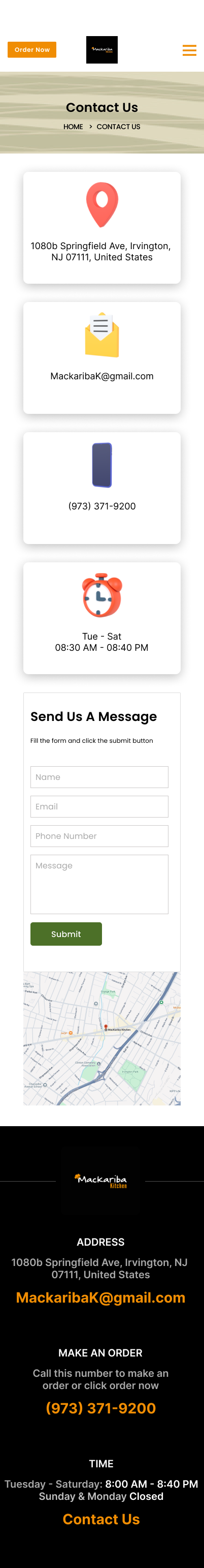
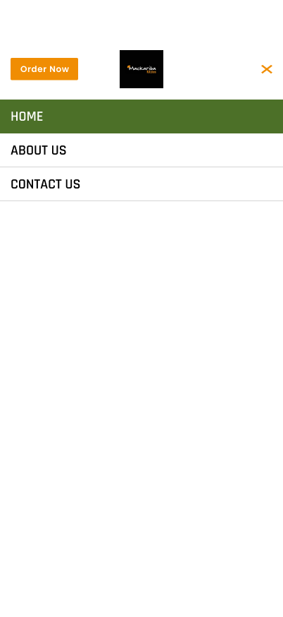
Mobile Homepage/Contact
CTA
Logo
Popular Dishes
Headline
Call us
Instagram
About us
Contact
Hamburger
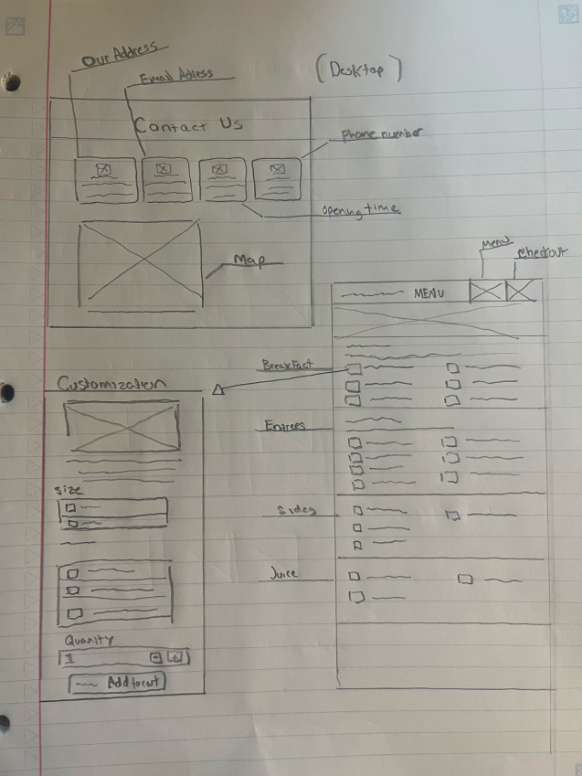
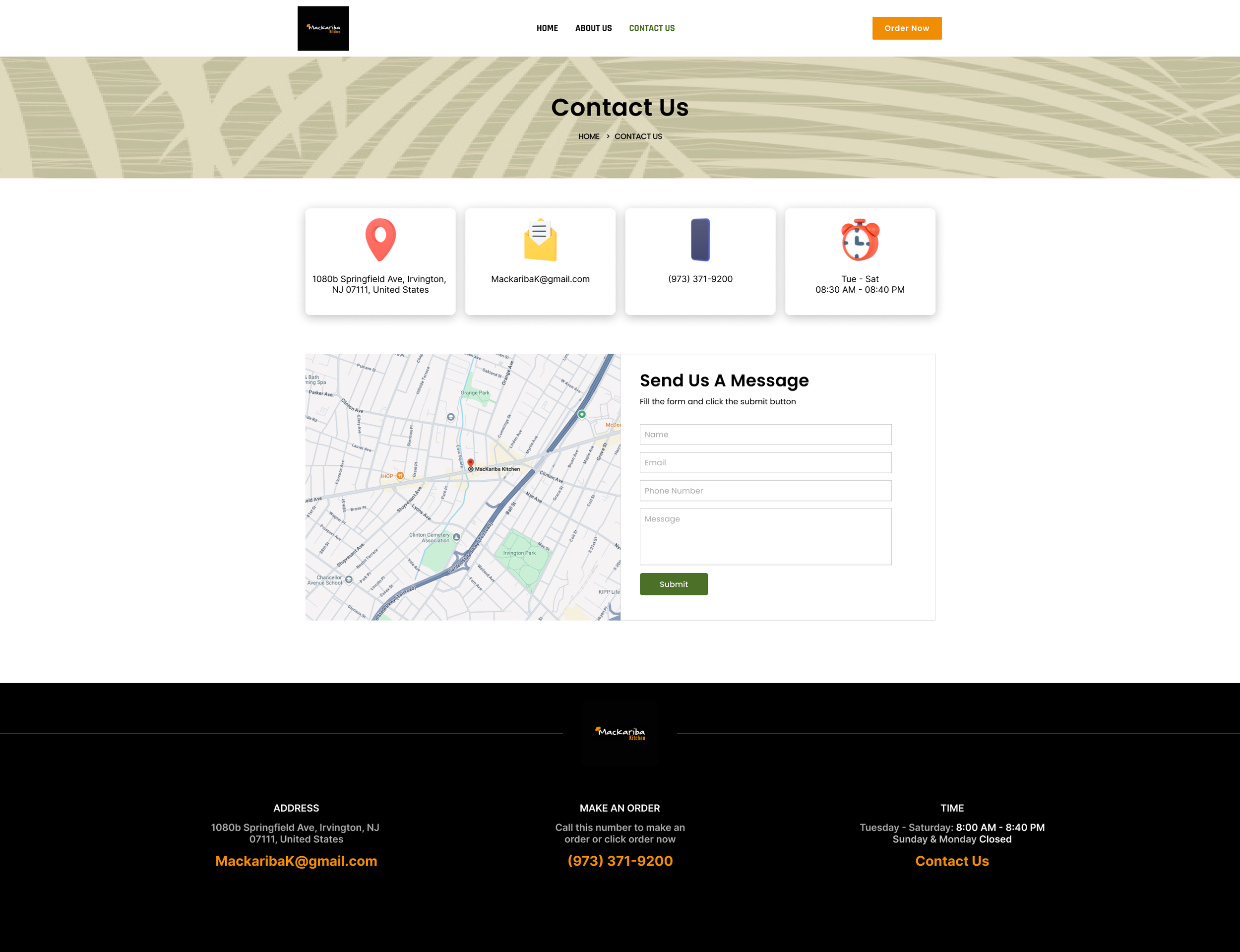
Desktop Contact/Menu
Address
Email Address
Phone Number
Times
Map
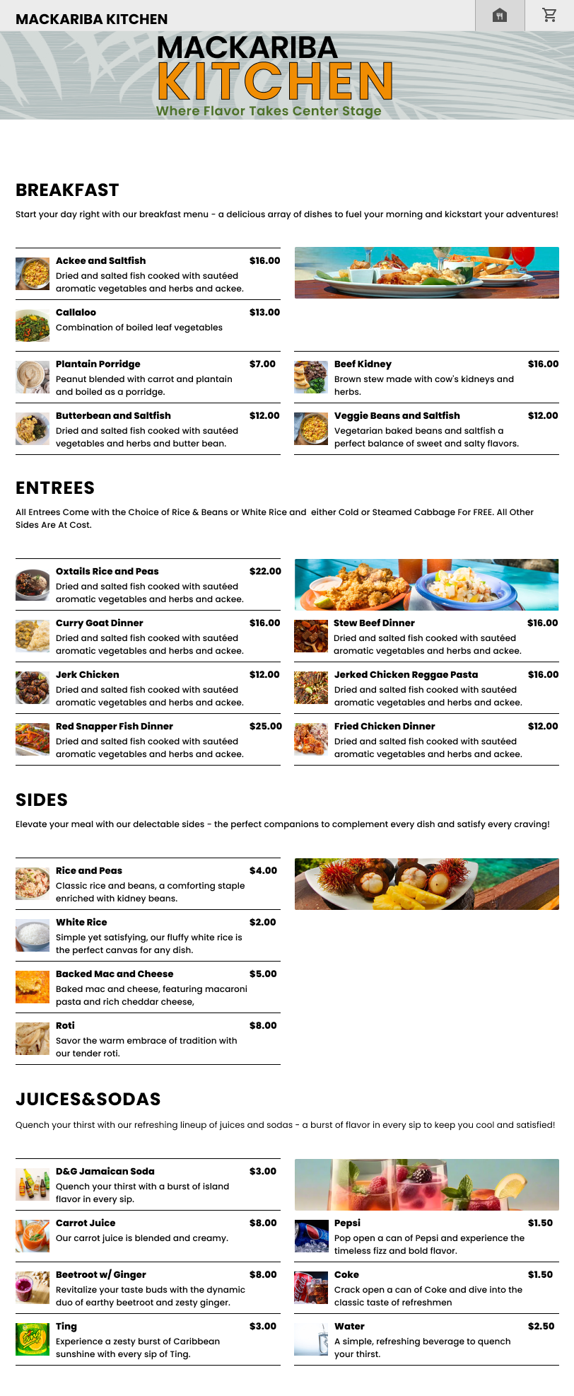
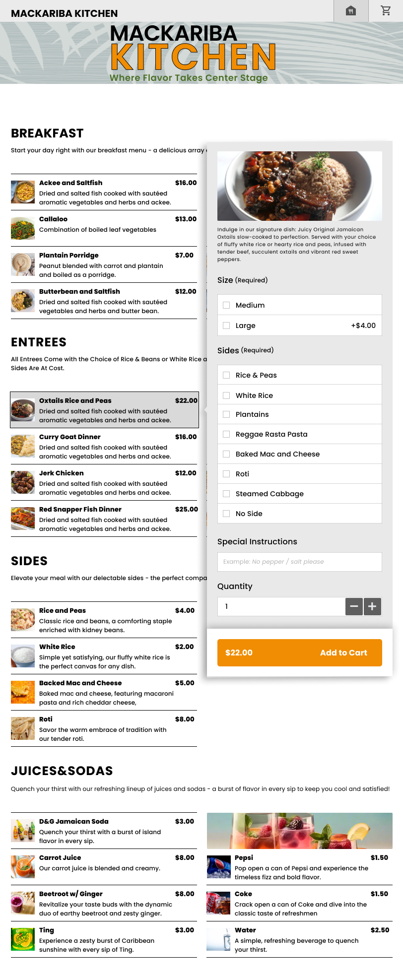
Menu
Customization
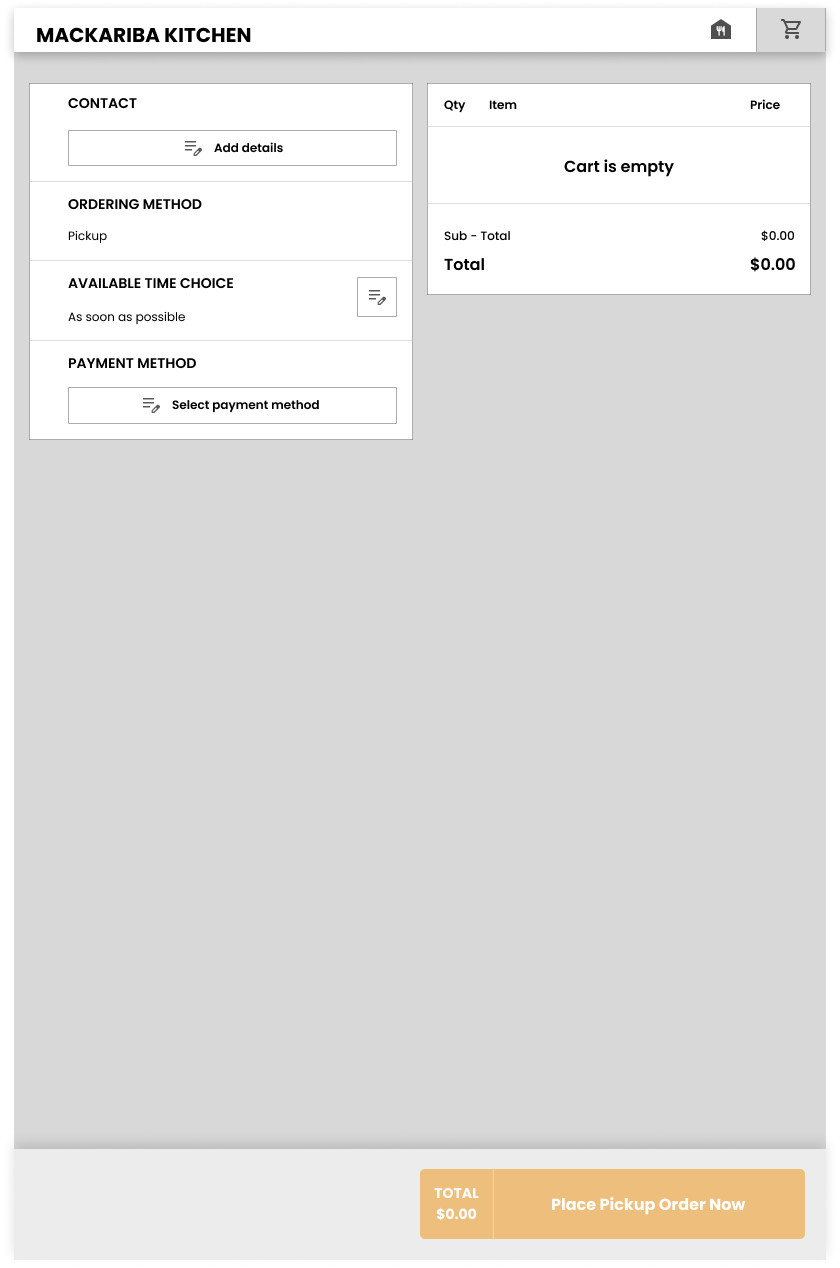
Checkout
Size
Add
Quantity
Size
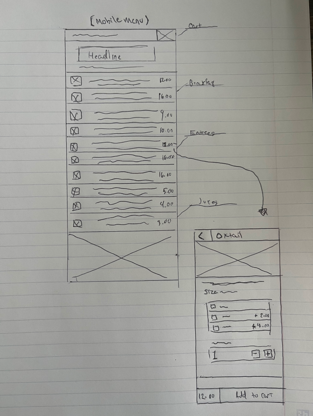
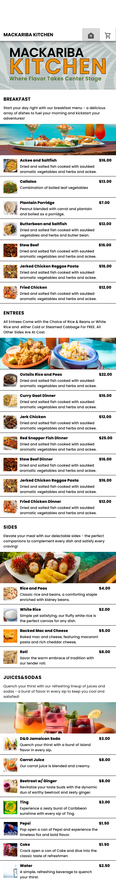
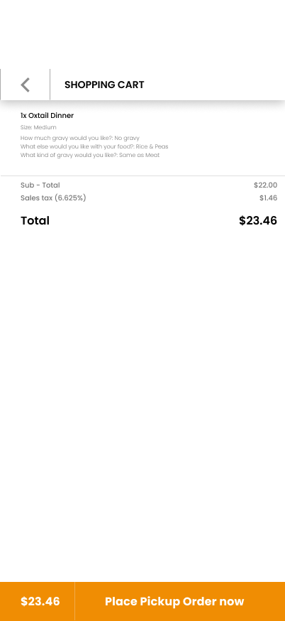
Mobile Menu
Headline
Cart
Menu
Customization
Size
Add
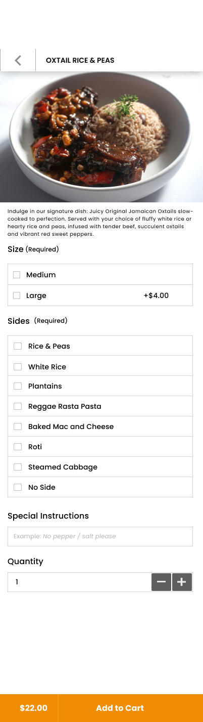
Prototype & Testing
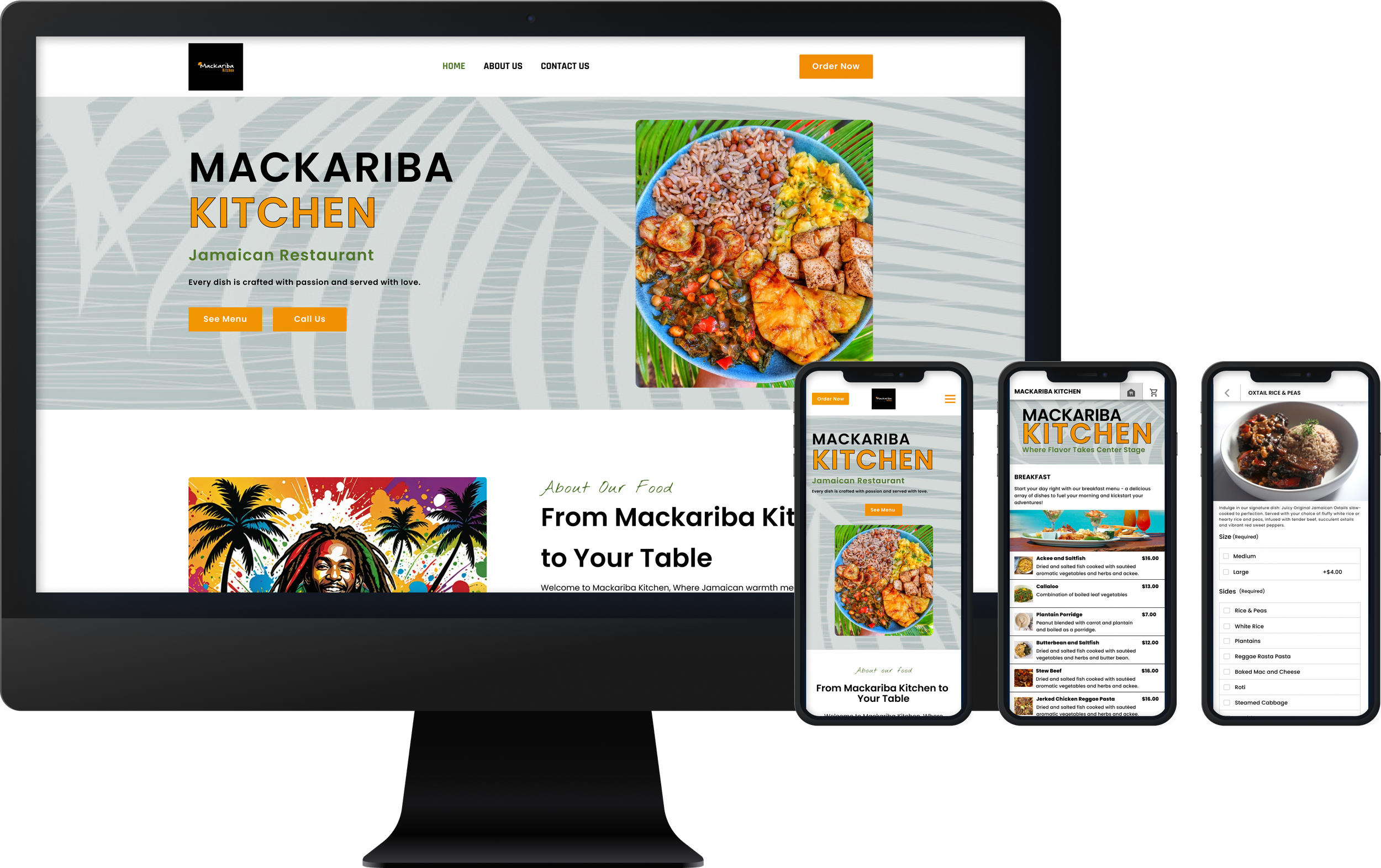
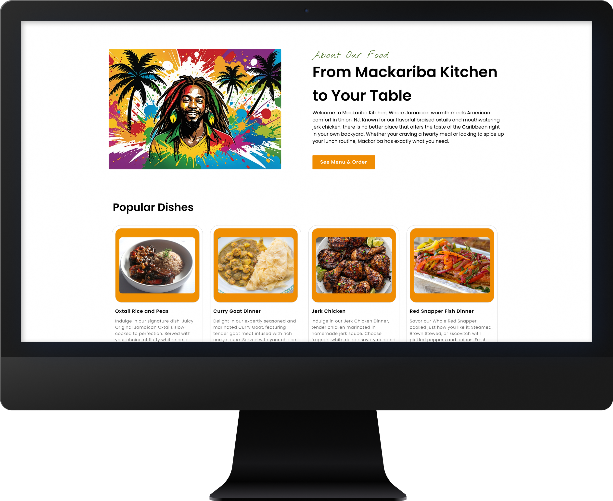
Building off of the blueprint from my low-fidelity designs I was able to smoothly transition into high-fidelity prototypes for both the mobile and desktop versions. I decided based off user research to use the mobile prototype for testing since most if not all my users say when ordering online they tend to use their phones. I was able to design the home screen, contact screen, about us screen, menu screen, customization screen and lastly the checkout.
High-Fidelity Wire-frames/ Prototype
Desktop High Fidelity Prototype
Mobile High Fidelity Prototype

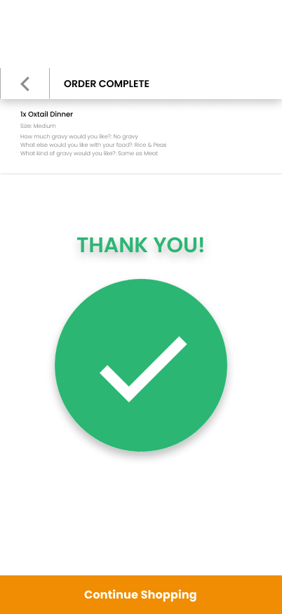
Usability Testing
I tested my high-fidelity prototypes with 5 users assigning them 6 task to complete.
Is the user able to complete the task without getting lost or clicking incorrect buttons or links?
How long does it take for the user to successfully complete the task?
Users satisfaction.
Success Metrics
0
TASK COMPLETED
ERRORS
6
EASE OF USE
10
Users enjoyed the simplicity of the application.
Users found the image quality good and easy to recognize.
User found the navigation easy to use.
Users found the information easily digestible and added to the experience.
Users completed every task without getting lost.
Being my first design with little to no negative feedback on my iteration process I focused on a couple quality of life issues in my file such as grouping naming and overall consistency.
Iterations
Reflection
Designing for a responsive website has taught me the level of consistency and mindfulness that has to come with designing for both desktop and mobile, when designed with intent the translation into one or the other can be a seamless process but if not you can end up doubling your work or worse agitating the client whose time is not unlimited. Testing and making sure your work is not only acceptable for your users but also for the client was always at the forefront of every design decision made. Helping un-tap the potential this small business had was a treat, in the end I was able to provide a digital product that will help push this restaurant brand and build trust between new and old customers.
Check out my other work