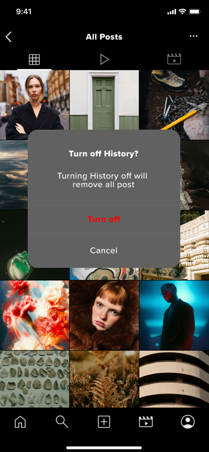
Instagram History Feature
The feature that allows users to find recently viewed content that was previously lost.

Background
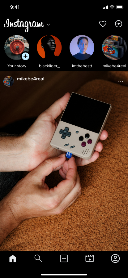
Instagram is a popular social media platform primarily focused on photo and video sharing. It allows users to upload, edit, and share content with followers or the public. Users can interact with posts through likes, comments, and direct messages, and they can follow other users to see their content on their feed.
Problem
Have you ever been scrolling through your feed at breakneck speeds absorbing all Instagram’s platform has to offer and you find something you want to send someone just for your entire feed to refresh? I most certainly have and come to realize there is no fix for this just keep scrolling. I immediately thought of how useful a history option would be and decided to dive deeper to see if I was the only user that felt this way and if not how may I design a feature that can allow for ease of use in such a bloated application.
Objective
Implement a history feature for instagram that can allow for users to find old post they passed by or lost before they were able to send, save, or like.
Research
My goal when starting my research phase was to test my hypothesis when it came to how useful users think a history feature would be on this platform, also I wanted to see if there were any other avenues I could pivot to if my hypothesis turned out false.
Primary Research: User interviews with people who regularly use social media apps
Secondary Research: Competitive analysis on different social media apps for insights and methods on how they track content
Methods
I also conducted competitor analysis among the other top 4 applications that have social features such as ( X, TikTok, Youtube, Snapchat) to see how they attacked this issue of loosing content or if they just let it be like Instagram.
User Interviews
7 users interviews were conducted to understand how my users prefer to combat lost content and what they actually use Instagram for.
Users were positive towards a history feature
Time is a key factor when it comes to user retention
Bookmark is the preferred way my users save information
Privacy is a non negotiable when it comes to my users personal information
My users lose focus when the UI is muddied.
Insights
User interviews reveled that my hypothesis was spot on, when it came to loosing content on Instagram all my users found it to be a frustrating ordeal that only served to sour their mood and slow down their intake on new content. This gave me an all go as far as starting forward in the design process.
Research Synopsis
Define
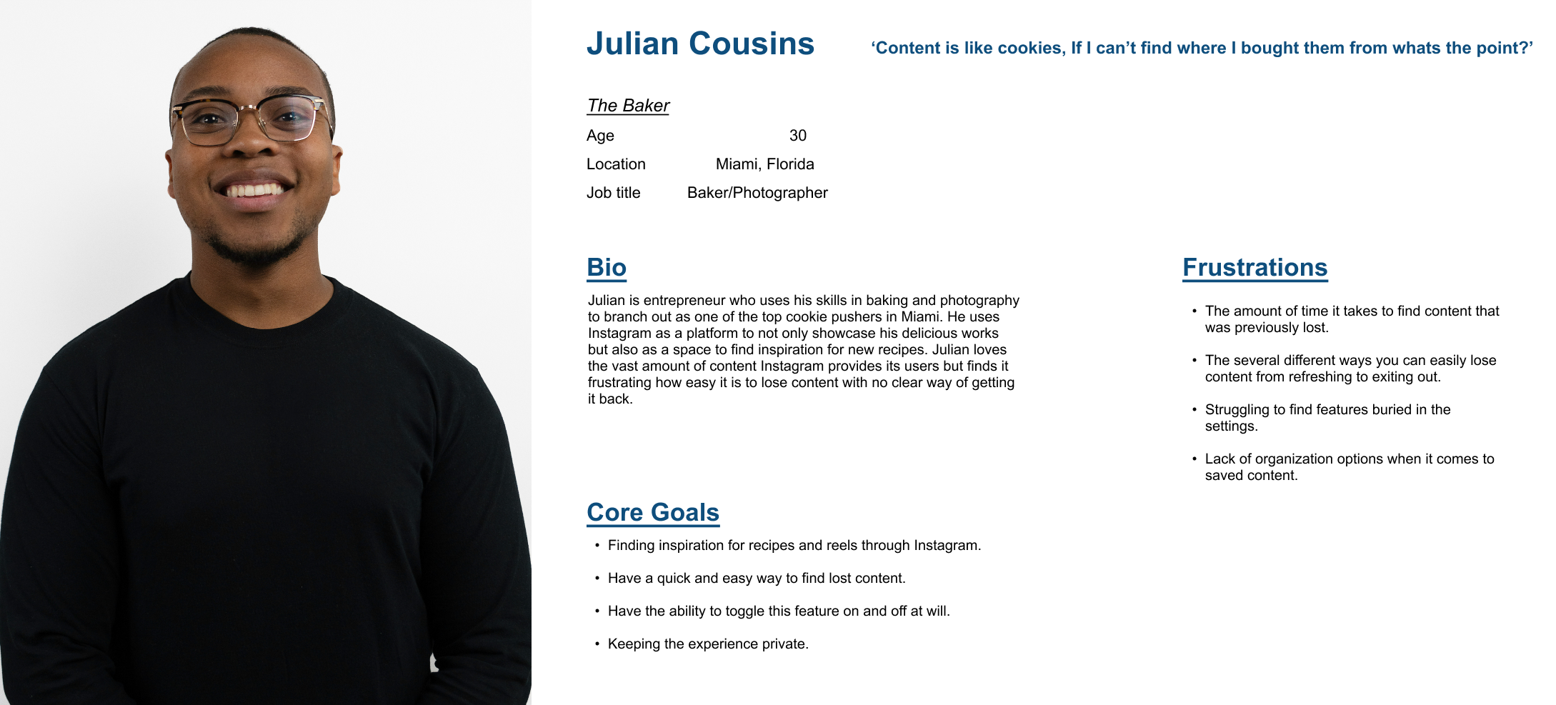
After analyzing my affinity map and user interview notes, I was able to develop a persona that represented the user group highlighting their key needs, goals, and frustrations. This was the main answer to any questions that arose during the design stages.
User Persona

Ideation
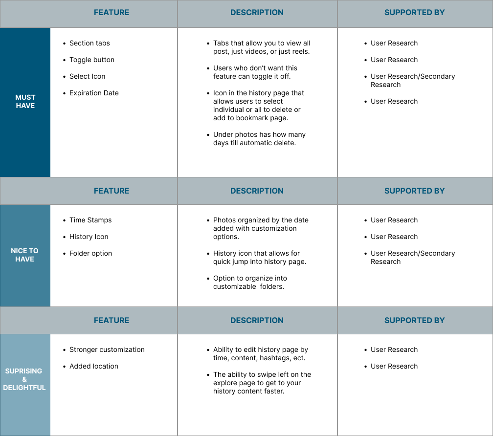
After defining my target audience and understanding who I’m designing for, I created a Feature Set to visualize and organize the features that will be included in the app. I prioritized the product features based on user’s needs and project timelines.
Feature Set
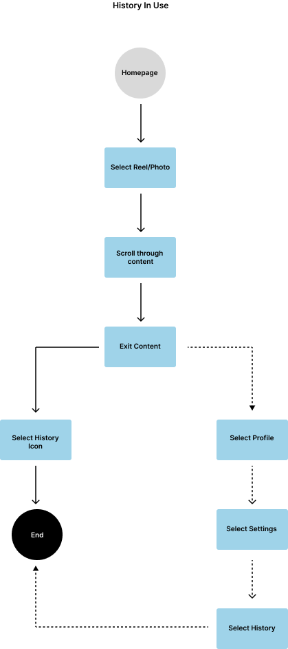
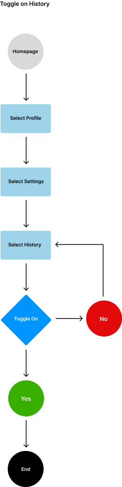
User Flows
After creating a Feature Set for the app, user flows were created to visualize how a user would go through the app’s functions and the intentions of the potential interface that I intend to design.
Design
Lo-fi wireframes provide me the ability of receiving quick user feedback and iteration before I go into the high-fidelity wireframes.
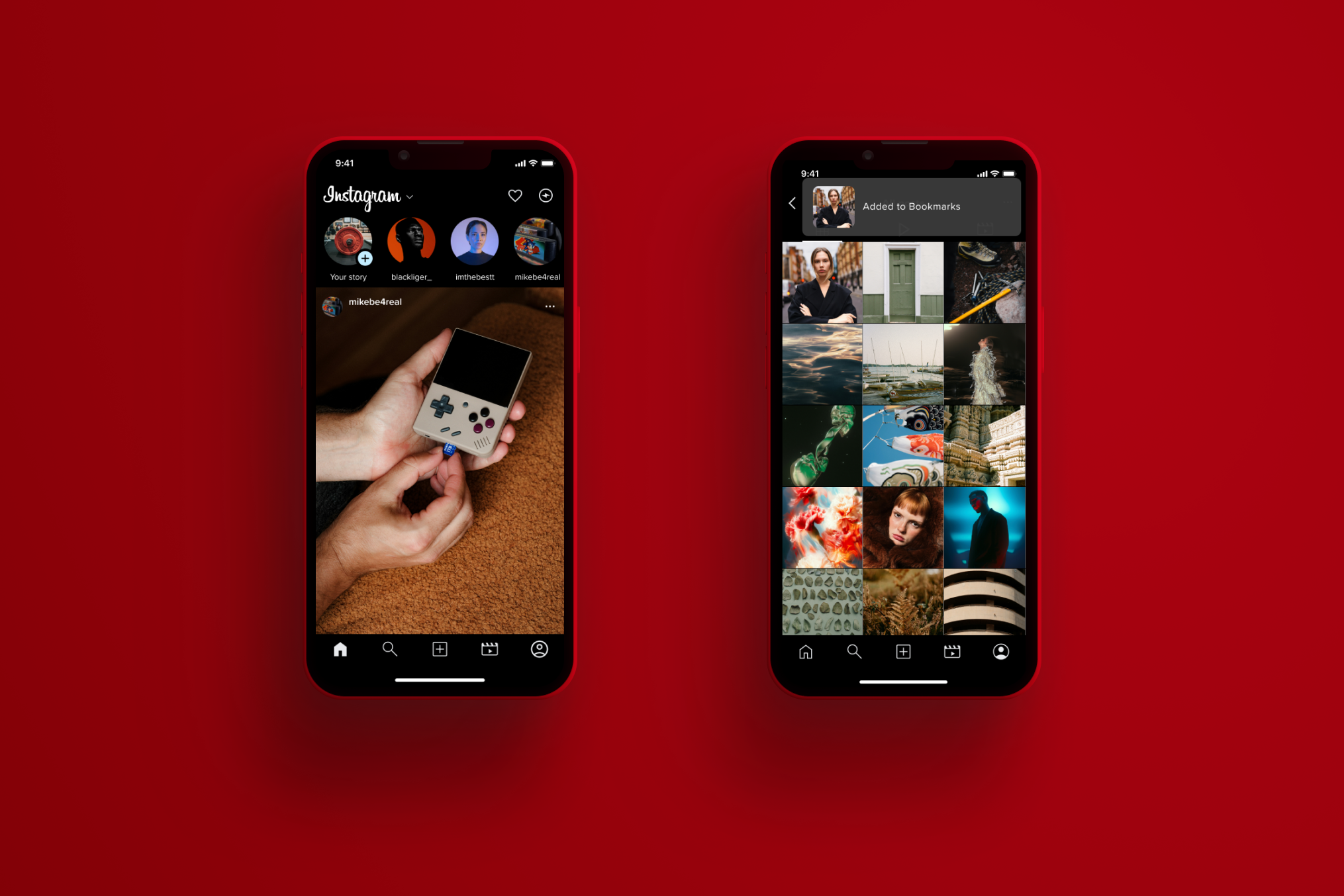
Low-Fidelity Wire-frames
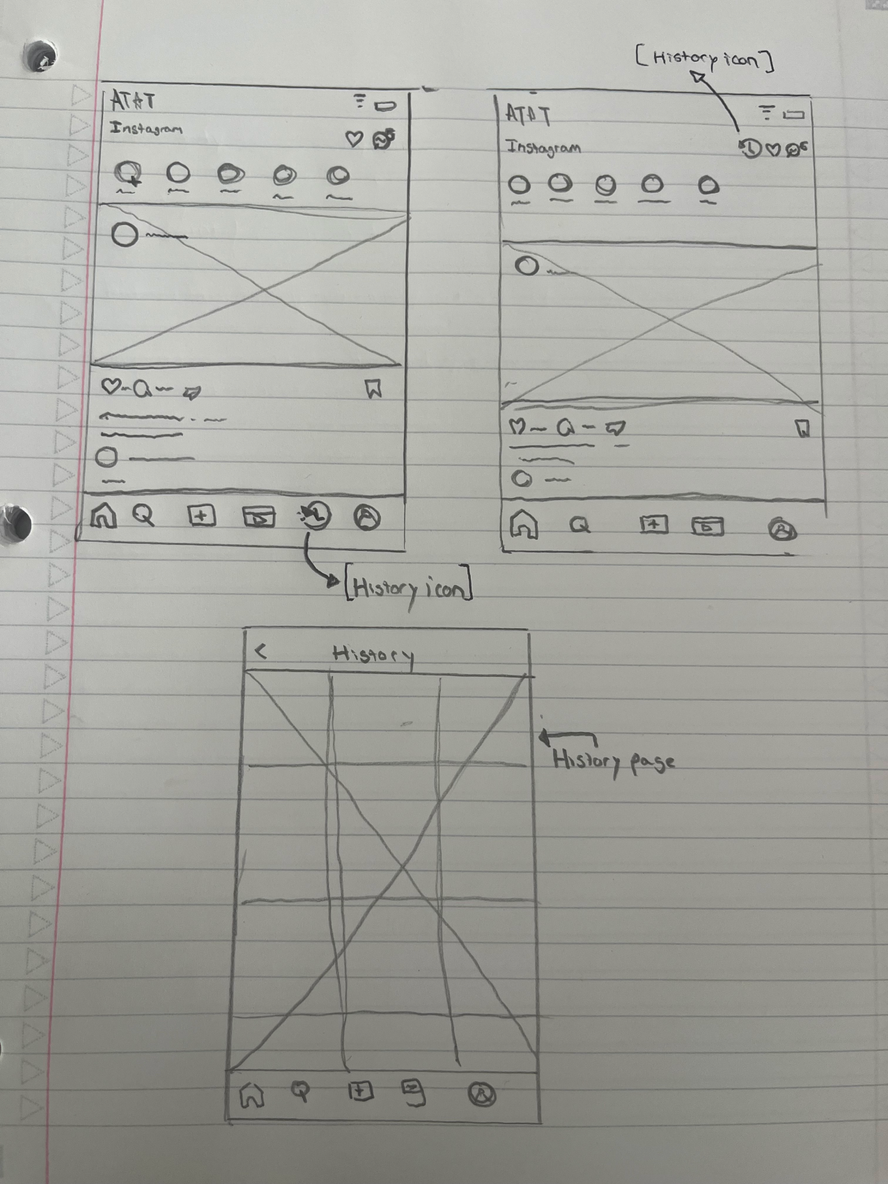
First top image (left) history icon in the home-bar for ease of access
Second top image (right) history icon in top right corner less crowded
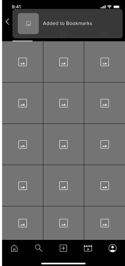
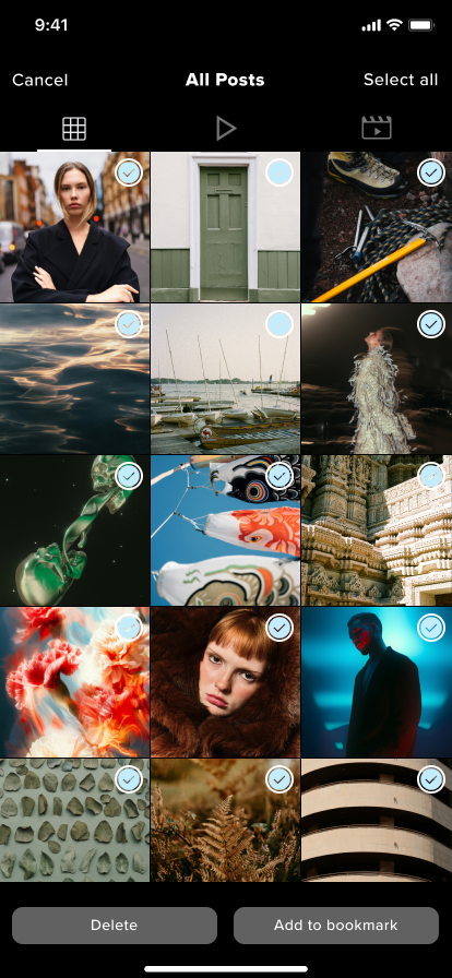
third image (bottom) history page modeled off of bookmark (based on user preference)
After testing my screens with 7 users I was able to rethink the placement of the icon since all the ones shown in my low-fi work are in such prime real estate.
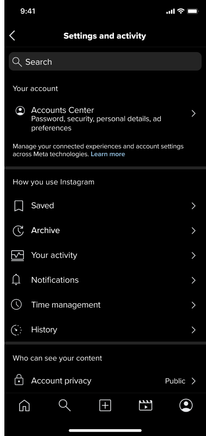
Mid-Fidelity Wire-frames
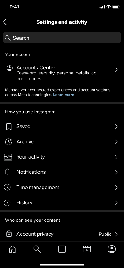
My feature found its way into the settings screen where it fit comfortably in the use section. With this set I decided to move on to mid-fidelity and more testing to see if the features placement was as intuitive as I felt it was.
Prototype & Testing
High-Fidelity Prototype
Building on the mid-fi wireframes and by utilizing the existing Instagram UI kit, I developed the hi-fi prototype.
Usability Testing
tested my high-fidelity prototypes with 5 users assigning them 6 task to complete.
Is the user able to complete the task without getting lost or clicking incorrect buttons or links?
How long does it take for the user to successfully complete the task?
User satisfaction
Success Metrics
10
6
0
EASE OF USE
ERRORS
TASK COMPLETED
Zero suggestions made, due to this being previously used platform once my user got started they were able to move quickly with no errors completing each task with extreme ease. The intuitiveness of the feature placement was all they needed.
Run through suggested updates and see how they stack up on the screens .
Work on refine each screen making sure size placement and grouping is good.
Final prototype check
Case study.
Next steps
Reflection
Adding a feature to an already existing IP was an exciting role to play, it was my first time hoping into a project where most if not all the tools were availible to me from the start. This did come with some situations where I needed to plan out acccordingly how to use the space that was provided to the best of my ability. Learning about high real estate locations on an app where only the most prominent features should be placed gave me a stronger outlook when it comes to overall design flow. I believe the final product I designed successfully address the core issues of my user group.
Check out my other work