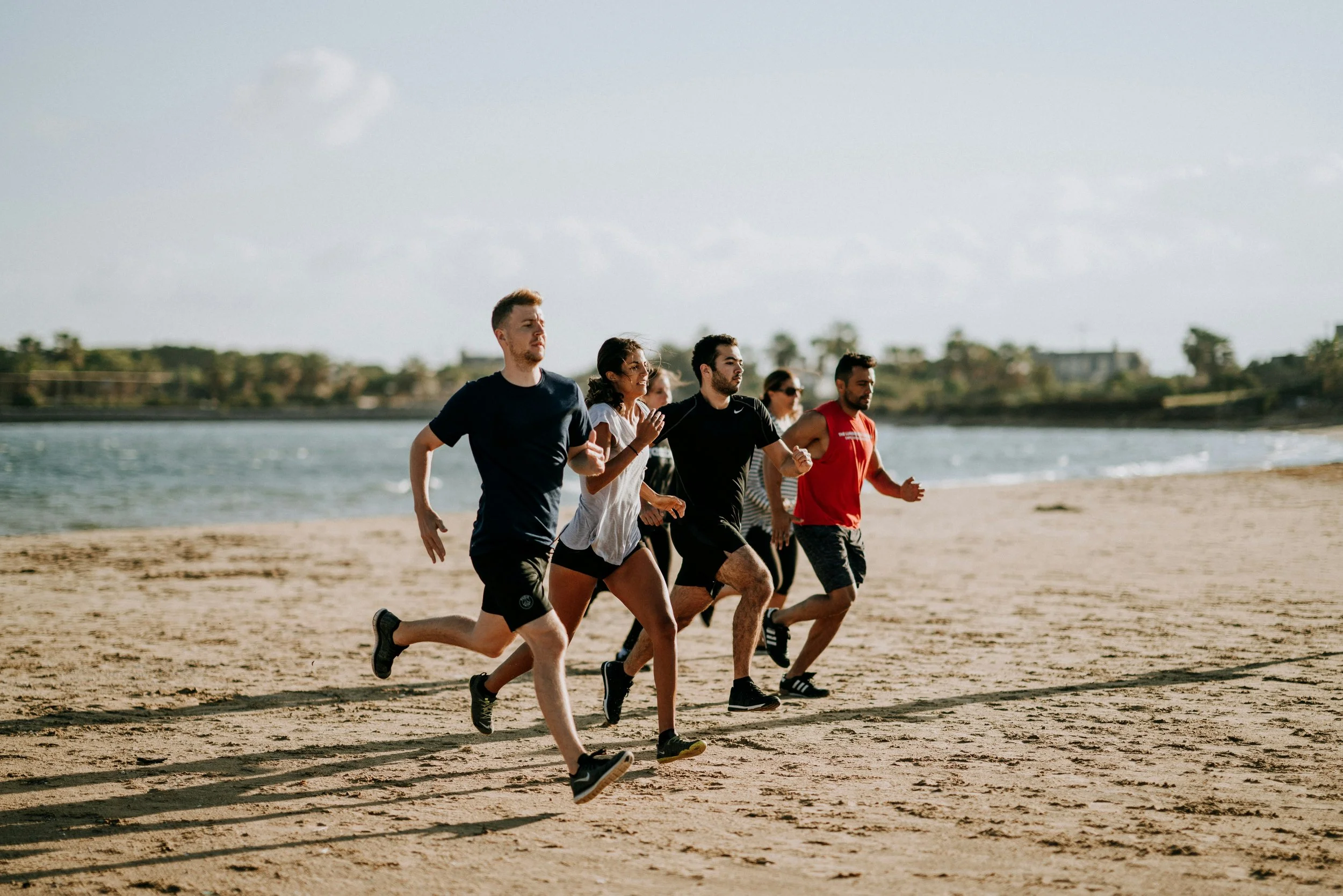
Taking the guess work out of health and wellness.
Timeline: 3 months
Role: UX Research, UX/UI Design
Wellnest is a website developed to help users with hectic schedules find quick and easy exercises/recipes that help to reach their health goals through the use of video and written instructions.
Background


Research
My goal when I started my research phase was to understand how my users feel when it comes to exercise apps, for that I made sure to interview through a wide lens of users. I need different age groups, which usually goes hand to hand with tech comfort depending on what era you came up in and lastly exercise experience. This in total will let me empathize with a wide variety of users giving my design process a much needed push to create an application that fits every type of user need.
Interview Criteria ( 7 interviews)
Age Groups:
Gathering insight on how users from different generations gather and understand information presented to them.
Tech Comfort:
Identifying any usability issues or barriers to entry for those less comfortable with technology.
Exercise Experience
This helped gather a broad spectrum of users when it comes to exercise levels which will allow for an experience that cater to everyone.
Insights Discovered
After completing my user interviews I was surprised from the insights I received. My initial hypothesis was that most users when it came to working out desired to track their diet alongside exercise for a more fully realized experience. My user research not only proved this to be incorrect but also let me know that they fully understood the importance of both in tandem but it just wasn’t that important to them. Keeping this in mind I was able to sift out preferred learning methods and core user frustrations when it came to learning new exercises and recipes.
Interview 1
“ I prefer a guided workout when it comes to learning something new”
Interview 2
“The value for cooking at home is not high enough for me to produce consistency”
Interview 3
“I understand completely the correlation with diet and exercise but tracking my diet is not important to me”
Define
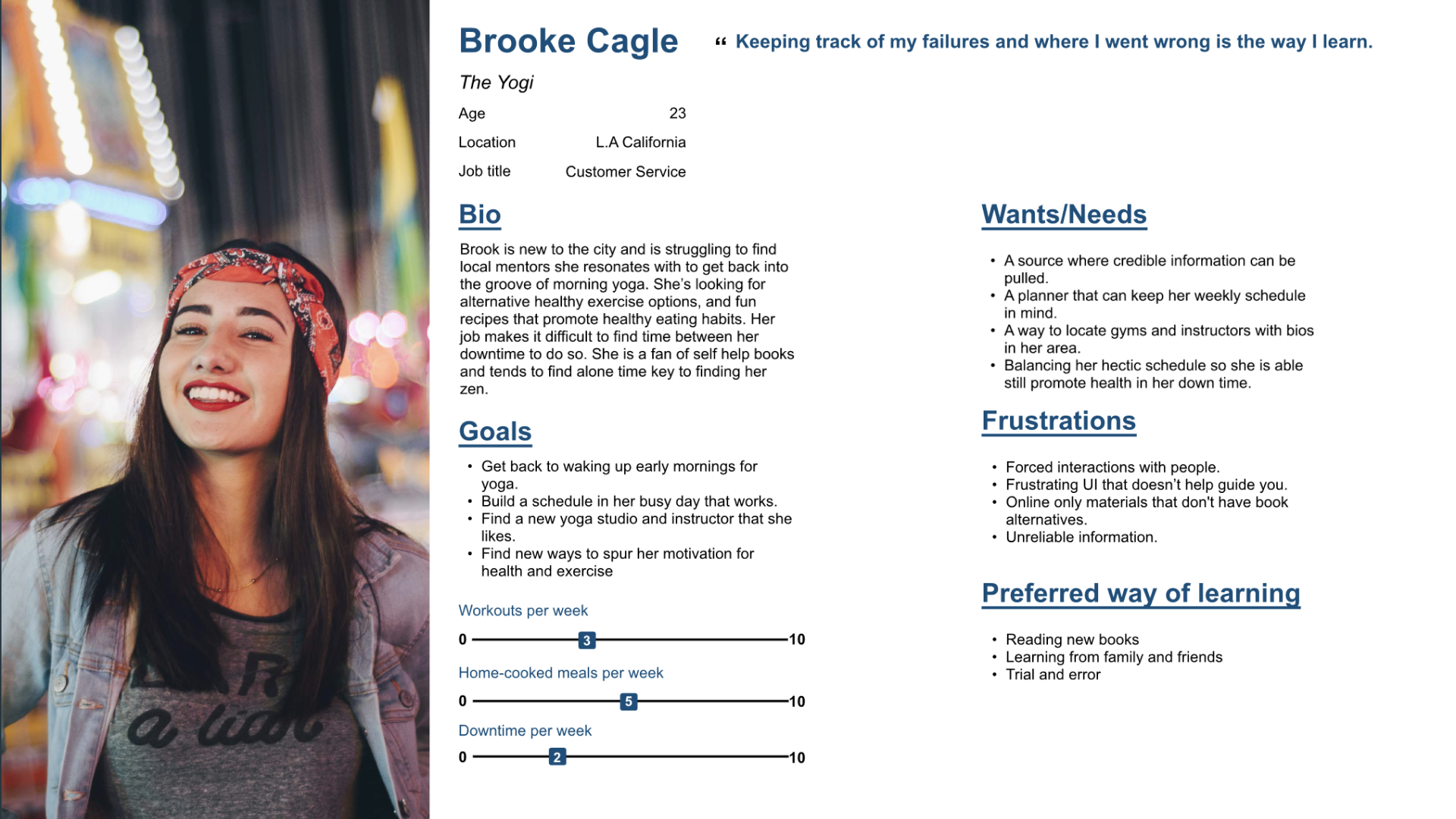
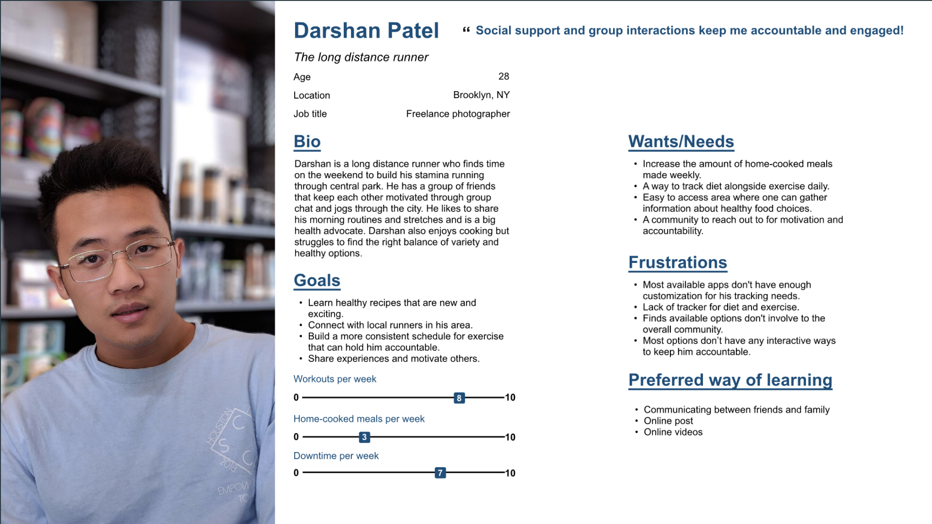
My goal when I started my research phase was to understand how my users feel when it comes to exercise apps, for that I made sure to interview through a wide lens of users. I need different age groups, which usually goes hand to hand with tech comfort depending on what era you came up in and lastly exercise experience. This in total will let me empathize with a wide variety of users giving my design process a much needed push to help create an application that fits every type of user need. Brooke was on the beginner side of the coin while Darshan was a more experienced runner on the expert side.
User Persona
Ideation
After defining my target audience and understanding who I’m designing for, I created a Feature Set to visualize and organize the features that will be included in the app. I prioritized the product features based on user’s needs and project timelines. After getting feed back from my mentor I was clued in on how much “Must-Have” the application currently had, we started to think of different ways to trim the fat off. With limited time what was the minimum version that could be developed that still solved most of my users problem. These were some of the questions I asked myself moving forward.
Feature Set

Site Map
My excess feature problem didn’t stop there unfortunately, I was reminded once again of how bloated all these features came across as soon as I worked through my sitemap phase. After working through this issue with my mentor again I was able to skim even more fat off the application to fit a more realistic schedule and workload. Even the updated version was a little much but way more achievable with the time allotted.

Less features
What is necessary?
What can be cut?
What do my users absolutely need?
Question to ask myself
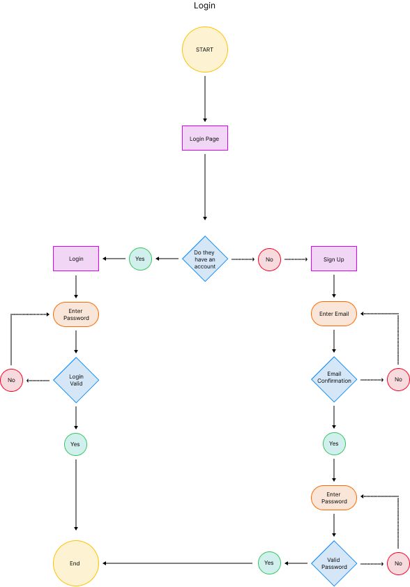
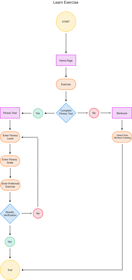
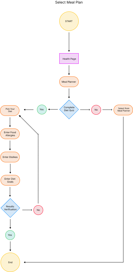
User Flows
While mapping out my user flows I began to see how my issues from bloated content can start to bleed into my designs going further into the process. The flows themselves were do able just had a lot of content to sift through and with limited time that could hinder the other process that need time to bake in the oven as well. I decided to keep an eye out for any features that didnt stand out as mandatory going further along the design process.
Design
At this point of the development process I was able to visually see how limited the space I had to use so even more cuts were made to the space in order for the flow to feel more natural. I had several diffrent variations set so my users can test and see which one fit more seamlessly in the end.
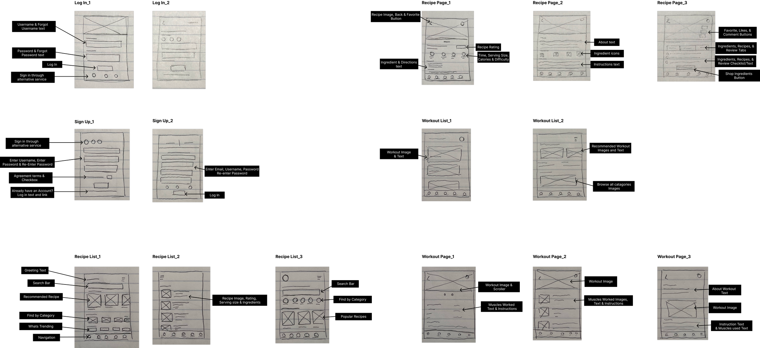
Low-Fidelity Wire-Frames
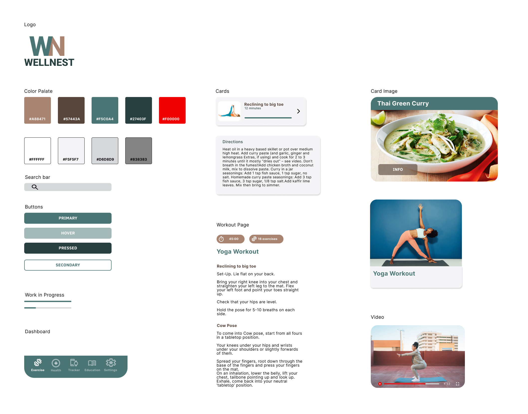
UI Kit
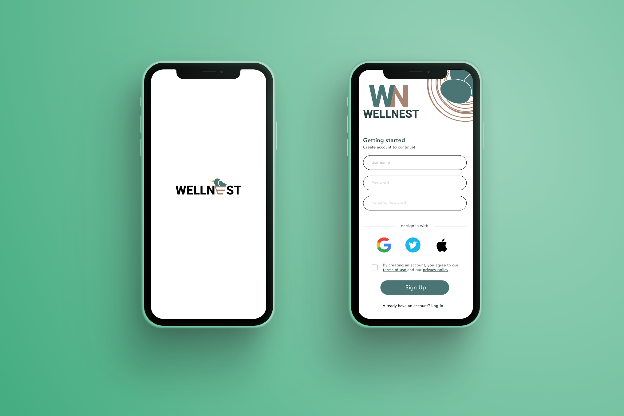
I came up with the name “Wellnest” to convey a certain tone, I wanted users to feel a certain comfort while using my platform. I wanted anyone exploring this design to feel welcomed, safe and prioritized which a well made birds nest provides all of. The name provides a sense of peace and trust that a lot of my competitors overlook.
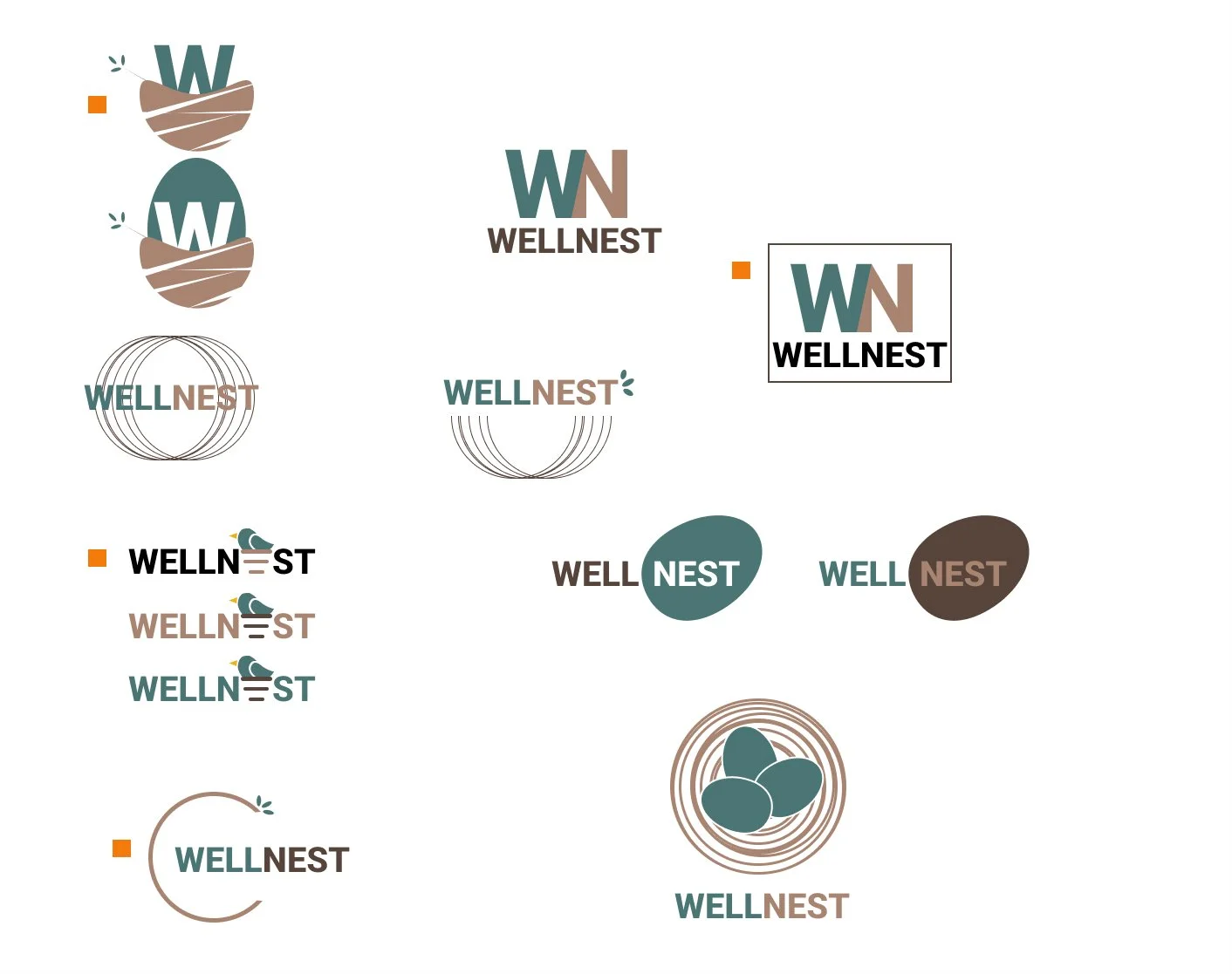
Prototyping & Testing
At this point of the development process I was able to visually see how limited the space I had to use so even more cuts were made to the space in order for the flow to feel more natural. I had several diffrent variations set so my users can test and see which one fit more seamlessly in the end.
Mid Wire-Frames
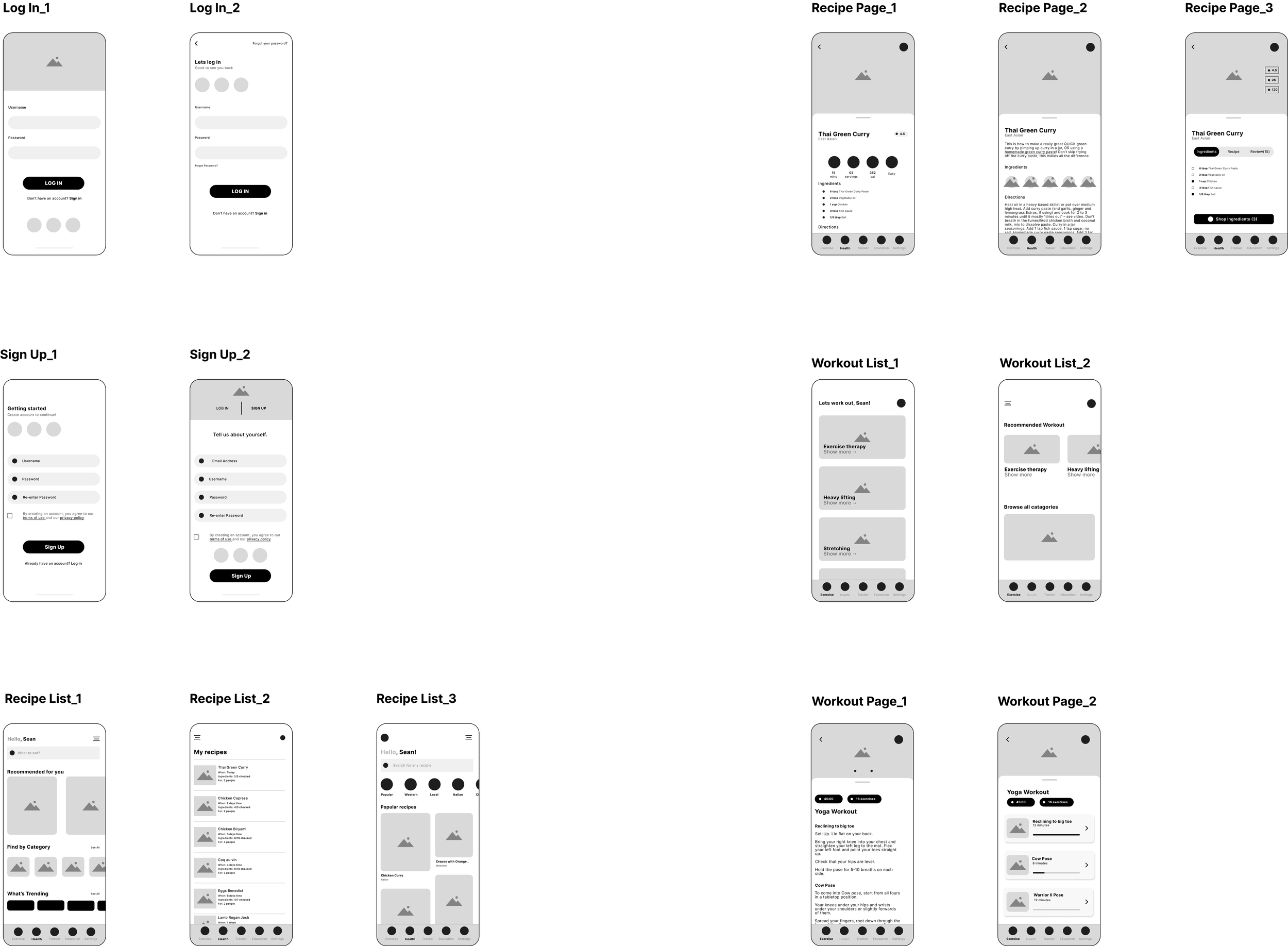
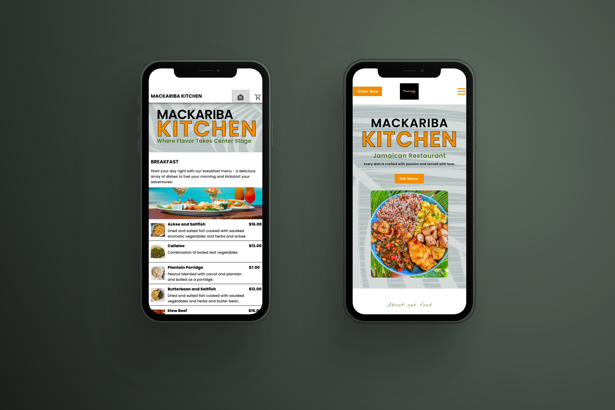
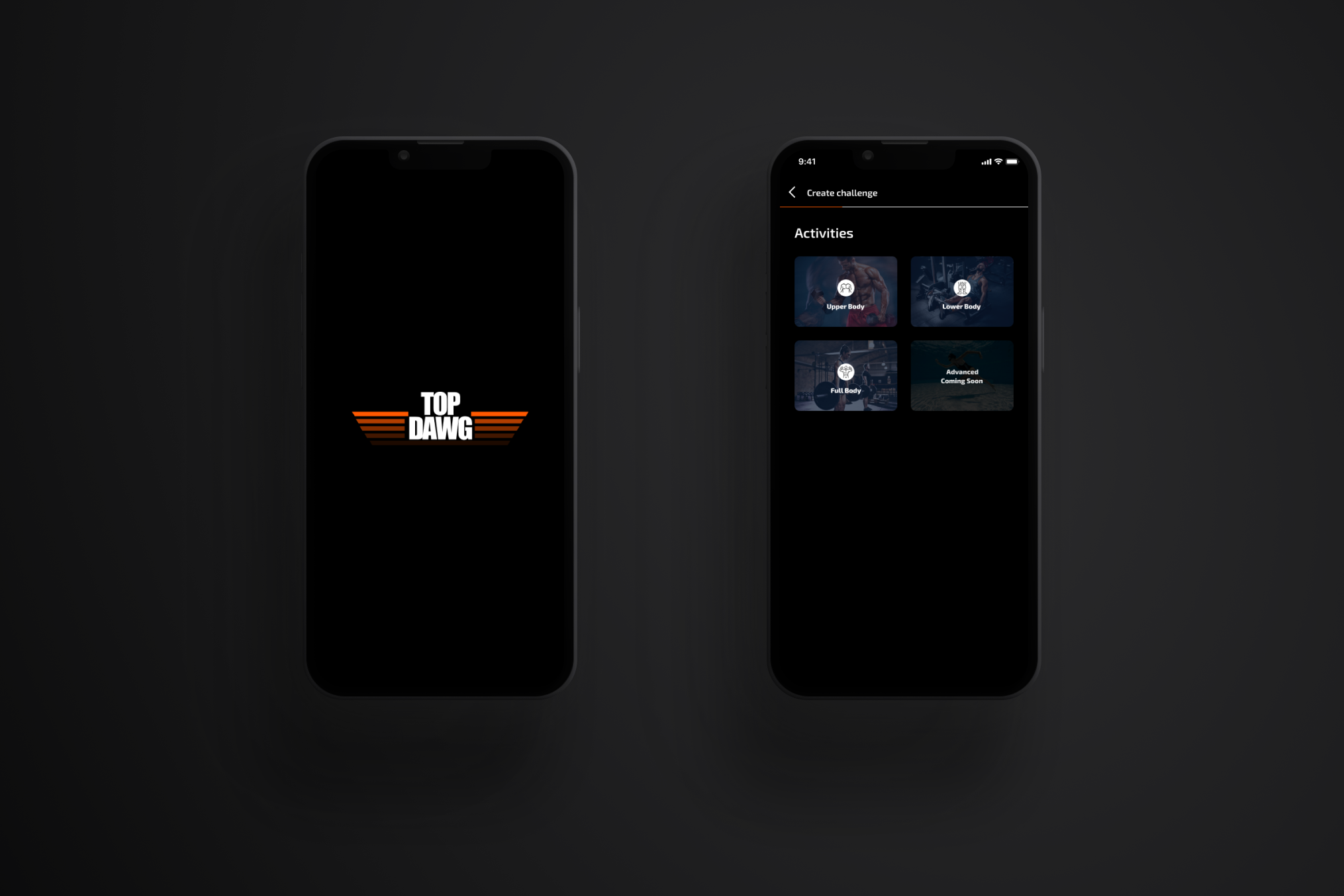
High Fidelity Screens
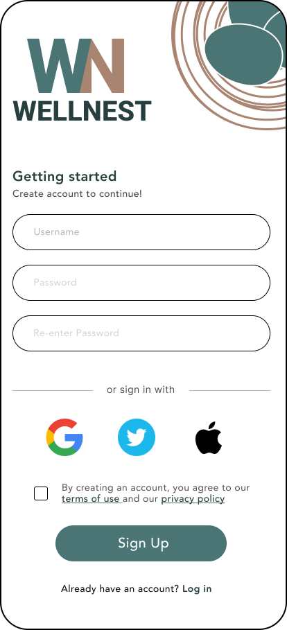
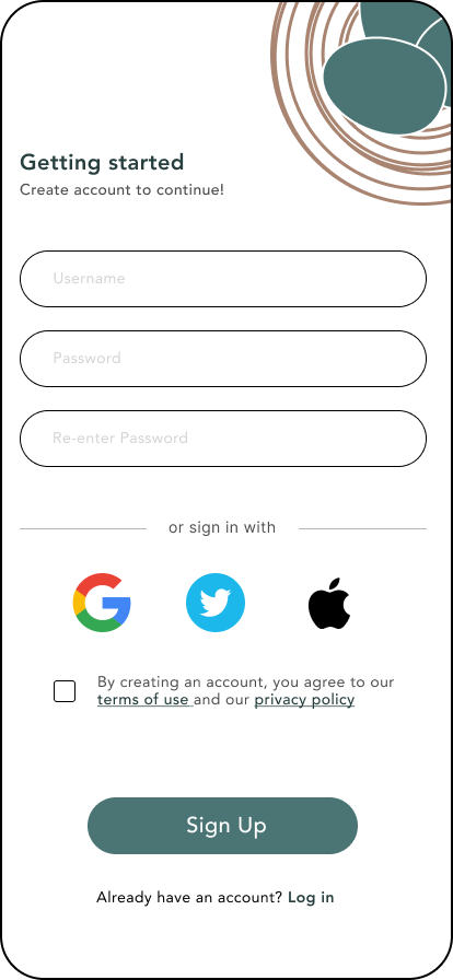
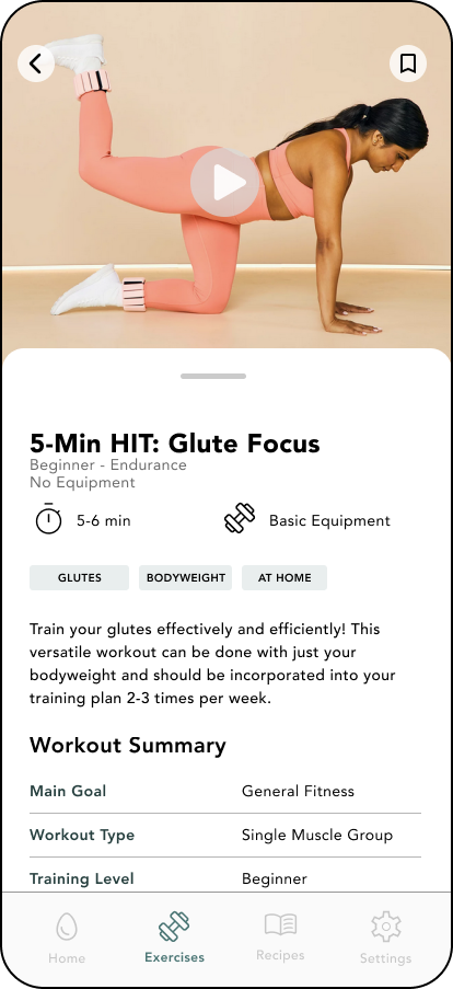
Sign Up
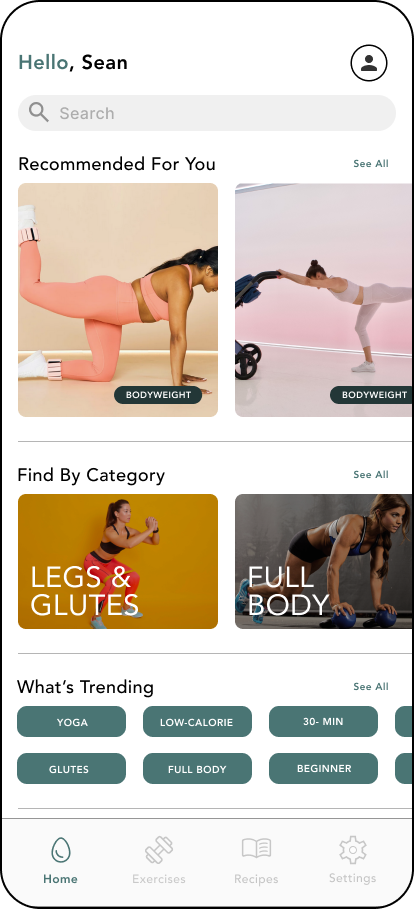
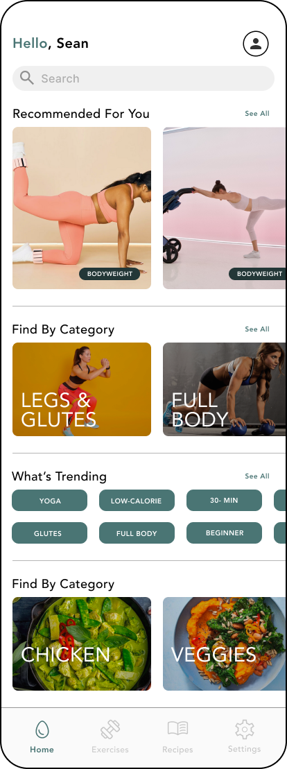
Homepage

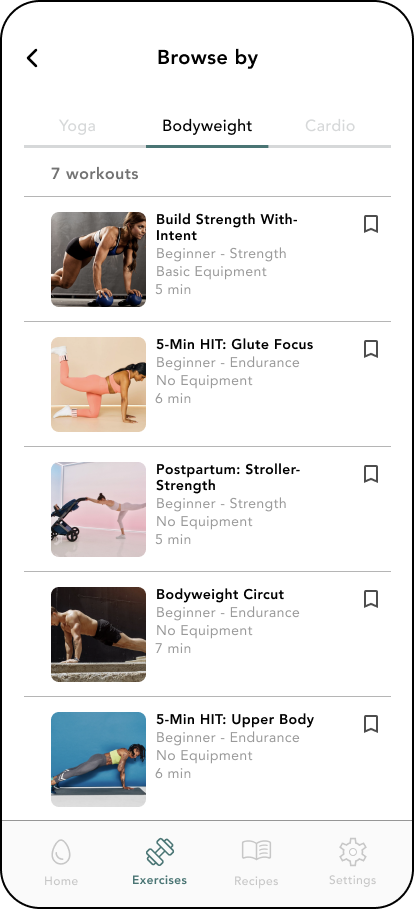
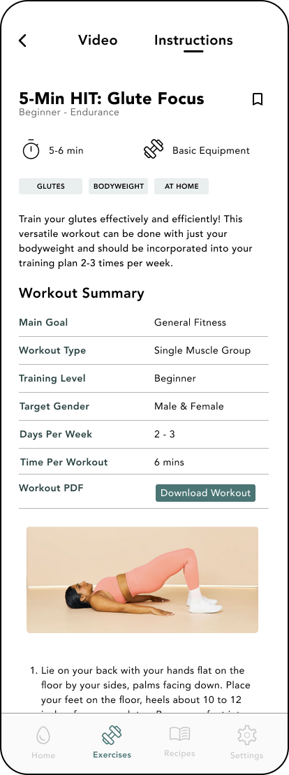
Exercise Page
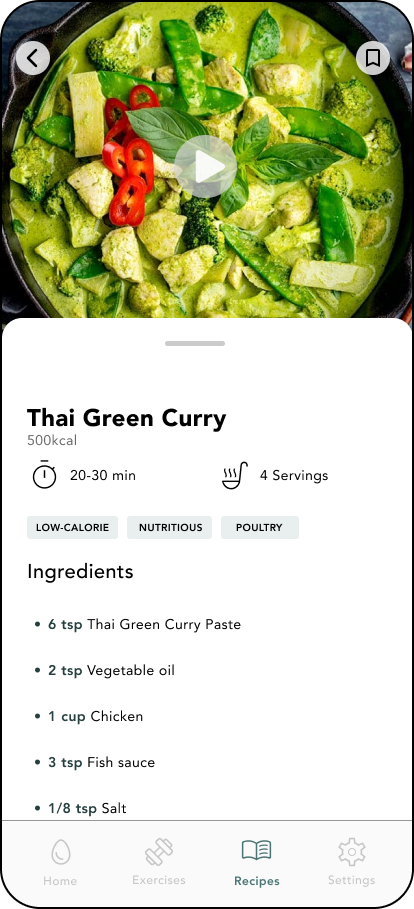
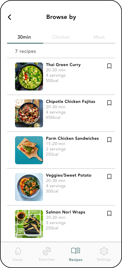
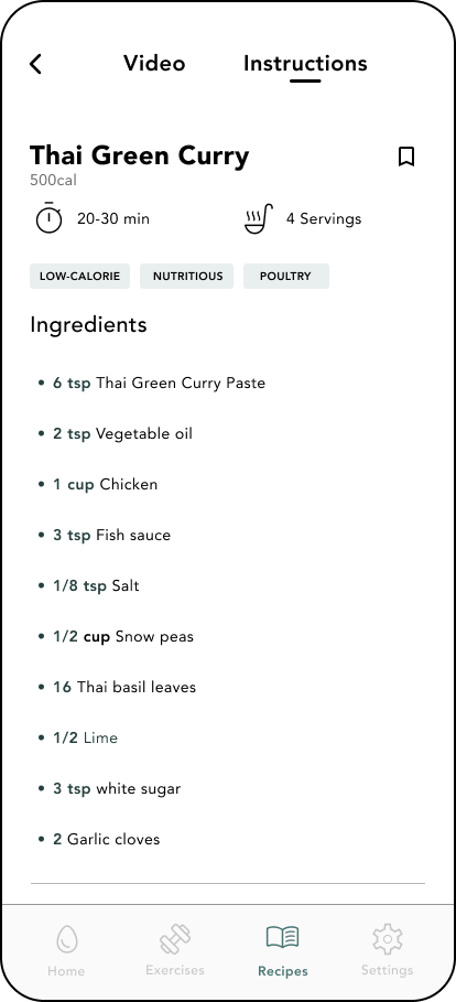
Recipe Page
Testing with real users
I developed a test plan and tested the prototype with 5 participants. Allowing for quick understanding on what worked and any oversights that needed to be addressed.
What needs an update?
2/5 found it easy to sign out of the app
3/5 found the video format appealing
3/5 found the homepage easy to navigate
What worked?
5/5 felt the information provided was concise and easy to understand
5/5 felt ready to complete exercise after reading
4/5 found the navigation easy to use
5/5 felt ready to complete recipe/exercise after reading through instructions.
Design Update 1
BEFORE

AFTER
Logo added
Adjustment to spacing
Color adjustment on sign in text
Design Update 2

BEFORE
AFTER
Find by category added
Additional options on whats trending
Carousel added on whats trending
Color change on recommended highlight
See all added along side images
Sign out page was moved to both the user icon and settings
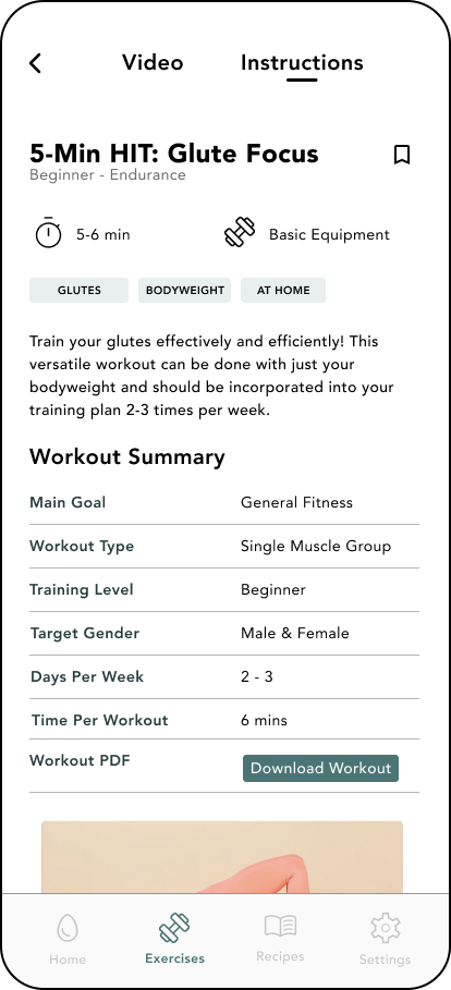
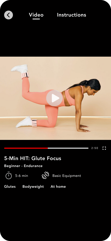
Design Update 3
BEFORE
AFTER
Instructions and video separated into two pages
Bookmark moved onto instruction page
No equipment text error removed
Key Takeaways
Continuous Development:
Throughout this project I was reminded that UX/UI design is something that is continuously growing and developing. Nothing designed starts at its peak, we as designers have to keep an open mind and adapt to our users growing needs and concerns. With that mindset our designs become more accommodating and flexible which in turn creates better and more accessible projects for the future.
Understand your Users:
While learning to design one of the biggest takeaways was learning that we design for our “Users” first and foremost. User research, Personas, these are the ways us as designers develop a stronger relationship with the ones we design for. Once that’s is understood the focus turns from “What I like” to “What does my user need”.
Simplicity&Consistency:
Great design does not always need to be over saturated. Some of the best works (Google, ect..) Have the most simplest layouts because they understand what the user came to do and make that the forefront. Learning I can start from that mindset then expand when I reach my users goals has been a huge eye opener. Staying consistent is also key to reaching new heights in design. Both visual and functional consistency play huge roles in how your design comes off to users.
Check out my other work