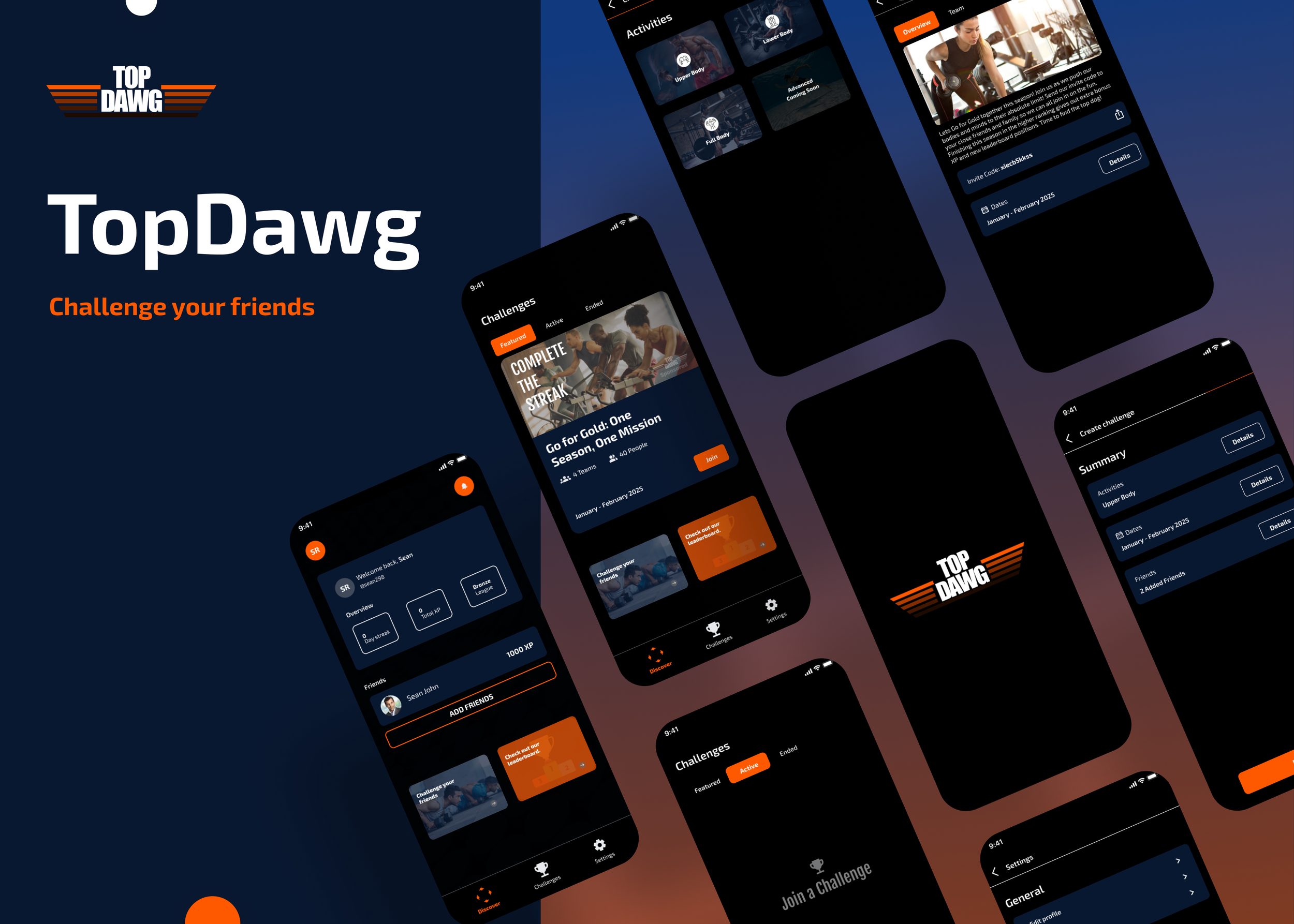
Top Dawg
End-to End MVP application for avid gym goers.
Role: UX Research, UX/UI Design
Timeline: December 12th - January 22nd
Background
The incentive to make it to the gym is difficult, especially with the fast pace nature of our daily life. Finding any motivating factor to get up and move is key to building a healthy lifestyle. Personally I’ve always enjoyed friendly competition amongst my close friends in our group chat, helping push each other every week to out do one another. This got me thinking of designing an all in one platform that allows for friendly competition between friends, I just needed to see if my users felt the same.
User Base
Friend Groups
Beginner, to intermediate gym goers
Goals
Get people exercising daily
Help intermediate gym goers make new PR’s
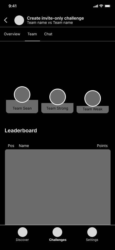
Promote healthy competition between friends
Add a new layer of depth to stagnated workouts
Provide easy and healthy communication between friends in different area codes

Research
My goal when starting my research phase was to understand what motivated my users generally speaking. Finding that very core motivating factor was going to be what pushes my idea for friendly competition or force me to pivot on to a different subject.
How do my users feel when people doubt their success compared to being cheered on?
How do my users feel seeing someone they know reach their goals?
Is being seen while succeeding important to you?
Are you a competitive when it comes to activities or exercises?
These type of questions help me narrow down how users feel about competition as a whole, which helped me build insights inside and outside of the design itself.
Methodologies
User Interviews
Competitive Analysis
Usability Testing
Competitive Analysis
To get a better understanding on platforms that offer Gamification as a motivational method I started to look at apps like “Duolingo”, “Pokemon Go”, and “Zombie Run”. All platforms that motivate there user to either learn or get up and move through fun/intuitive gamification elements. The social and competitive play that comes out of these applications helped build brand loyalty with their user base, but the question I had to ask myself was what was there original core experience like? What was the main features that they began with? How did it come across to users? These kind of questions kept me on path with developing a product that resonates with my own users.

User Interviews
After researching what my competition was doing I moved straight into my user interviews, between the 5 users who were interested in the gym and used apps with gamification elements I found some interesting insights. Not enough to make me pivot from my original idea but enough for me to lock into a more streamlined design process.
“Being seen succeeding is the least important to me. I just don't need validation from strangers, but when I’m in a game setting though I love being to show I won.”
“Seeing someone succeed only feels good when its people who are close to me. Especially when its someone who hasn't had a win for a while.”
“I don't really care when people doubt my success and hearing positive enforcement from the people I love is important to me.”
Research Synopsis
User interviews revealed that many interesting insights that almost contradicted themselves in a way. The one I found the most interesting is that my “users don’t care about people who doubt them and feel good when cheered on but oddly enough the greater motivator out of the two are those very doubters.” These very answers help me layout a design map in my head on ways to motivate my users organically using there own insights.
Define
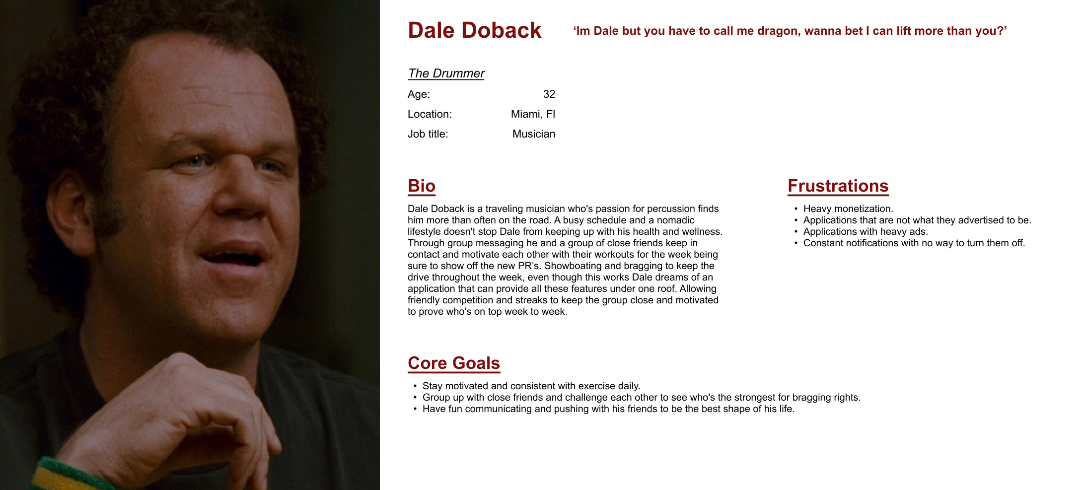
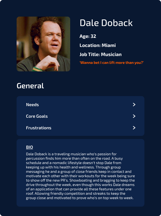
After analyzing my affinity map and user interview notes, I was able to develop a persona that represented the user group highlighting their key needs, goals, and frustrations. This was the main answer to any questions that arose during the design stages. Dale’s bio, core goals, and even frustrations all stemmed from previous user research making this a real living and breathing user that I could re-visit any time I needed.
User Persona
Ideation
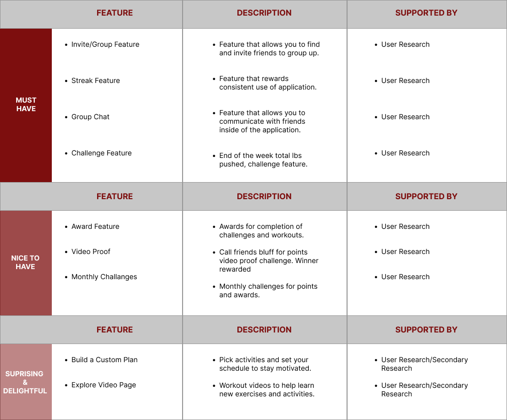
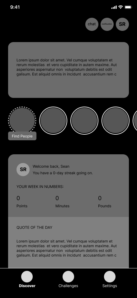
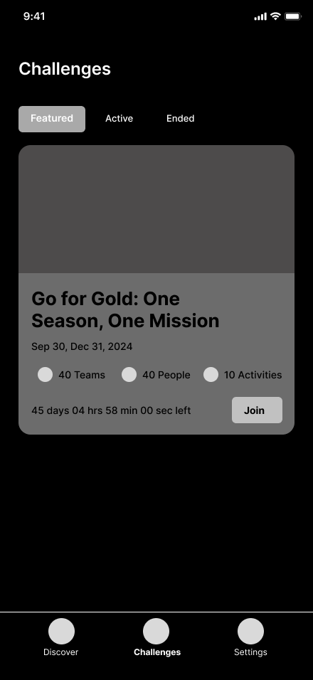
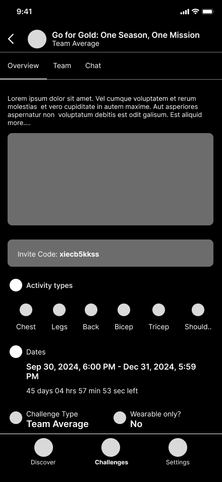
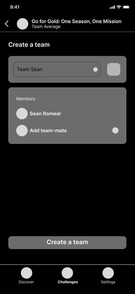
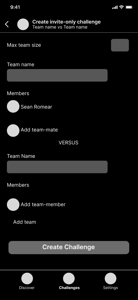
Now that I understood who I was designing for I moved on to developing a feature set. This was mandatory when it came to understanding what was to be prioritized in the design process and every piece of the puzzle was developed off of the user research that was done prior as will be a trend in my design method. This being a MVP I needed to make sure I only had the most necessary features available at first due to time constraints. Trimming out fat was my main concern, I kept my feature set handy throughout the design process just in case any more features needed to be delegated to a lower tier.
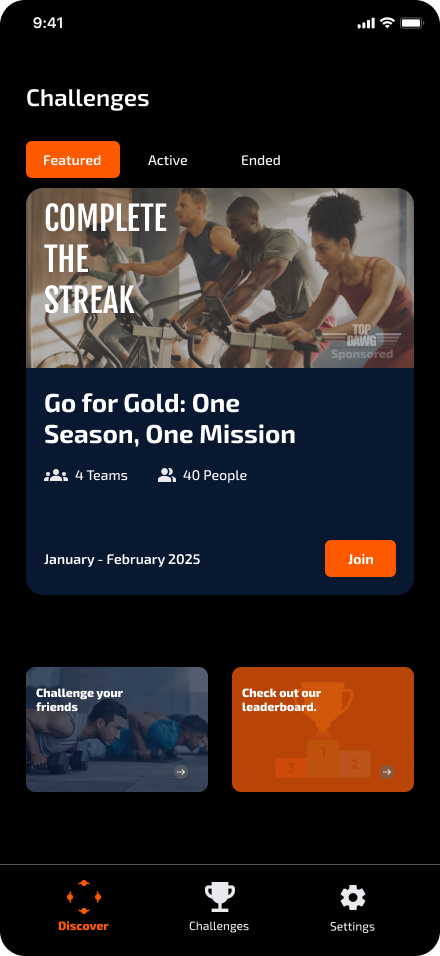
Feature Set
Site Map
Here is where things started to get tricky, since I was designing the application as an MVP I struggled with keeping it to the bare minimum of things needed rather than wanted. Even with the feature set helping me cut down on useless features at the moment I found myself adding more than necessary and had to make sure to keep scaling down moving forward through the design process. Less was more in this situation.
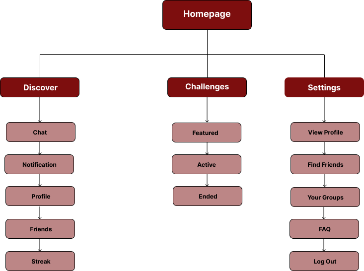
Less features all around.
What is necessary for a fully functioning MVP challenge app?
Is a friend list required?
What will be added in notification?
How will profile be set up?
Which features will be most time consuming?
How much can be gutted with the app still being fully functional?
Questions to ask myself
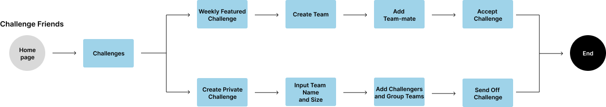
User Flows
While mapping out my user flows I was able to simplify further and get back on track as far as what my main design goals were, always going back to check on little decision through my persona and prior research. Since every piece of the puzzle worked together the flow charts started to develop themselves staying on track with how to simplify my users life with short paths and zero backtracking.


Design
Low-Fidelity Wire-Frames
Low-fidelity wire-frames allowed for quick and early user testing between my 5 users from earlier, gathering valuable feedback as far as where I needed to take this upon further iterations. This round of testing uncovered a lot of issues I was running into during my site-mapping phase:
Users suggested edits to simplify pages.
Users suggested add friend button to simplify grouping
Users wondered where the invite code would be implemented
Users wondered how activity types would be chosen
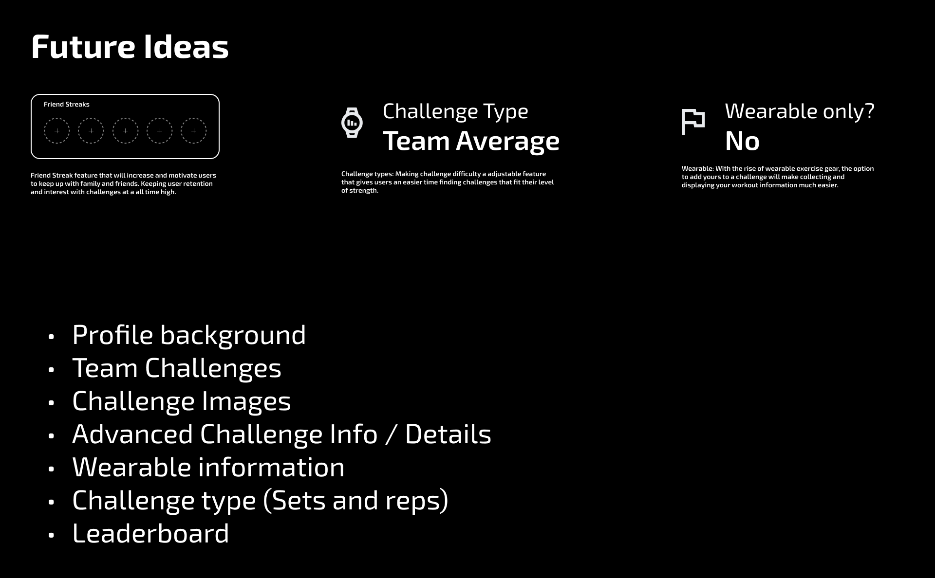
After looking over my feedback from my users I decided to cut down on a lot of the extra baggage in my features and save those ideas for future design possibilities.
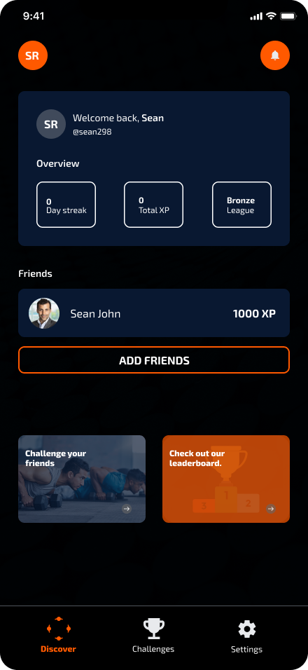
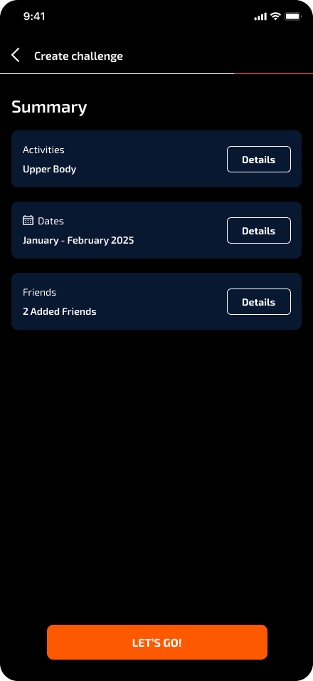
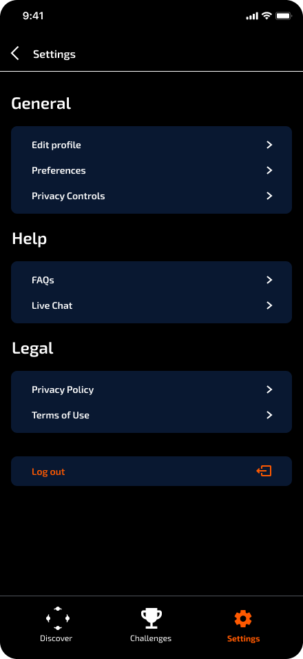
UI Kit
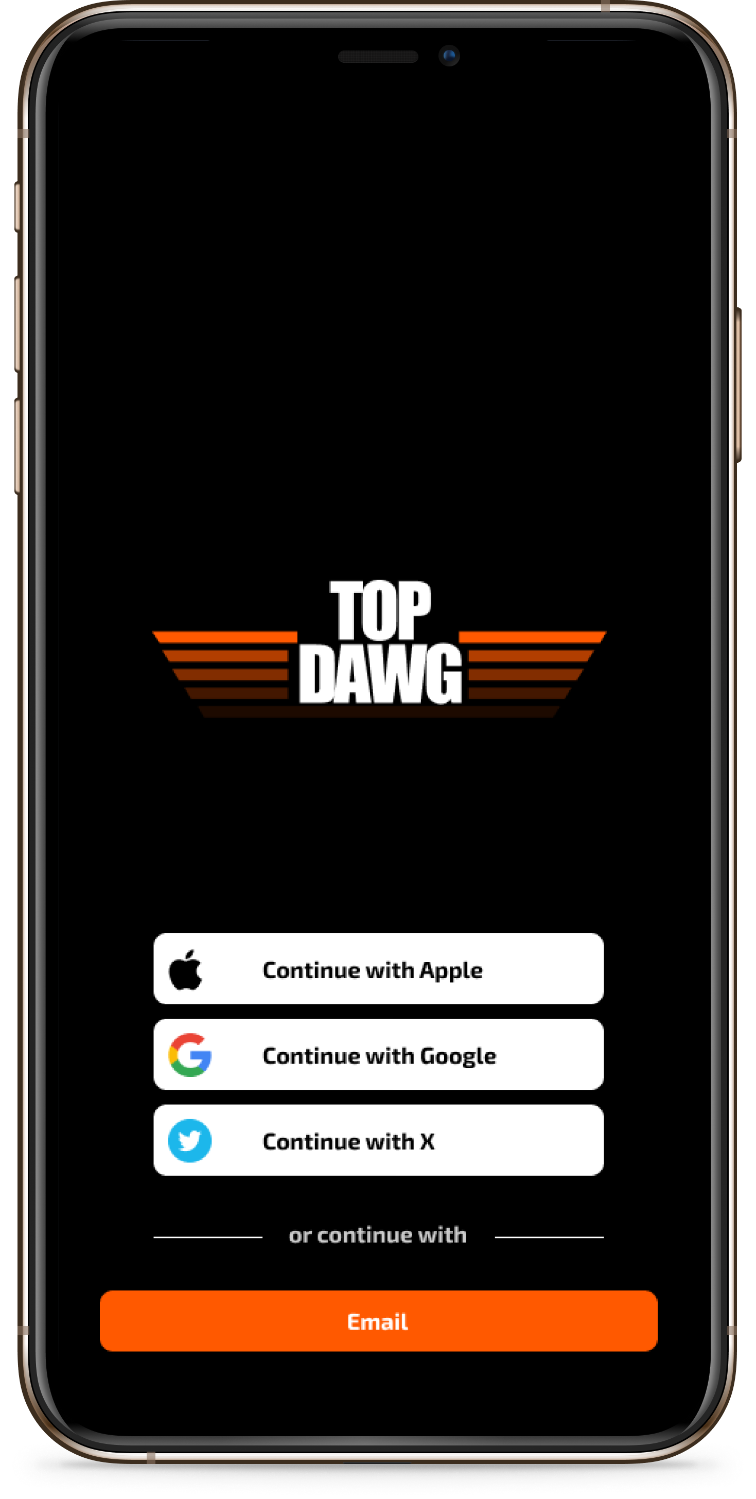
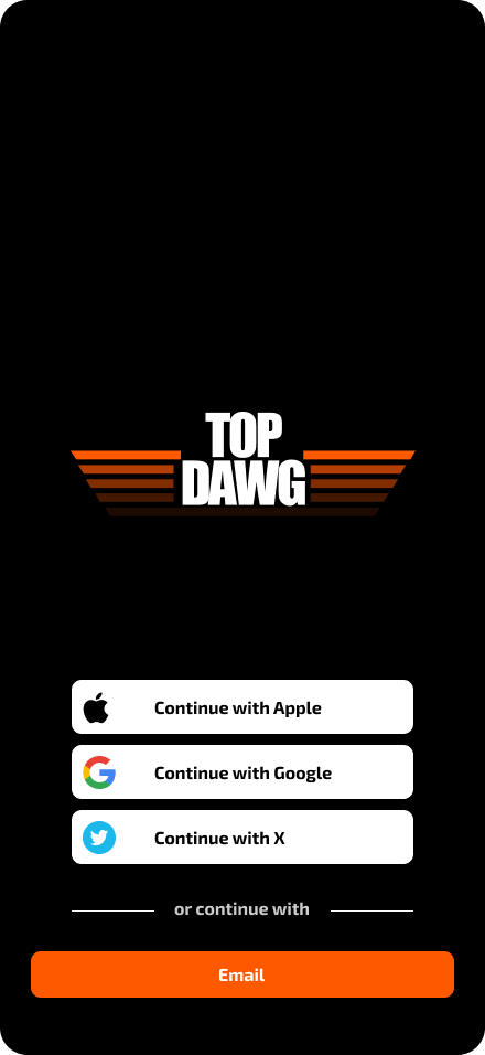
Keeping those iterations that needed to be made fresh on my mind I developed a UI kit to fit some of the core brand values I came up with for the platform. Going with the name ‘Top Dawg’ as a way to reflect the strong retro vibe I was going for. The palette was inspired by some of my favorite 90’s games giving it a high energy and exciting feel. Even though these were my ideas the design decisions at the end of the day came down to the research.

Prototype & Testing
High-Fidelity Prototype
Usability Testing
I tested my high-fidelity prototypes with 5 users assigning them 6 task to complete.
Is the user able to complete the task without getting lost or clicking incorrect buttons or links?
How long does it take for the user to successfully complete the task?
Users satisfaction.
Success Metrics
TASK COMPLETED
ERRORS
EASE OF USE
1
5
8
User suggested to swap the colors of the cards on the challenge page to find “challenge your friends easier”.
5/6 users were able to navigate the entire application with little to no difficulty.
6/6 users stated to love the simplicity and colors of the application.
1/6 users suggested a search button to find friends easier.
1/6 users suggested more ways to earn XP like joining the season or starting challenge
1/6 users said text was hard to see.
Run through suggested updates and see how they stack up on the screens .
Work on refine each screen making sure size placement and grouping is good.
Final prototype check
Case study.
Next steps
Reflection
Throughout this project I was able to really listen to what the research was telling me and focus on asking the right questions to get quality insights. Learning that when designing for an MVP I have to focus on trimming the fat off my features so I only design what is absolute needed at the beta stage. I believe the final product successfully address the core issues of my user group while leaving plenty room for future development.
Check out my other work